Phoenix Coyotes
2004 - 2014
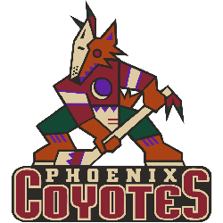
In 2003 - 2004, the Coyotes introduced a much cleaner, less experimental design to represent the team. The color scheme was simplified to a brick and tan, and the logo is way less busy than the hectic design that came before it.
Phoenix Coyotes
2000 - 2004
In 1999 the logo remained same with a darker shade of brick red and removed the wordmark "Phoenix Coyotes." The coyote image is much larger.
Phoenix Coyotes
1997 - 2000
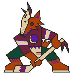
When first designing the logo, artist Greg Fisher was actually asked to stay away from something menacing and instead focus on embracing the Southwest culture in an attempt to make the Arizona residents feel the team truly belonged to them. The logo consists of a sienna-colored Coyote wearing half of a sand-colored goalie mask and a brick red hockey jersey with hunter green pants. Clutching a sand hockey stick with a purple crescent moon logo on its chest.
Striking Phoenix Coyotes Logo
Sports Fan Products