Montreal Canadiens
2000 - Present
The change to the current logo is again a closed red letter “C,” with its top and bottom edges curling into each other in a symmetrical shape. The “C” and the “H” are fused together. All enclosed by a thick blue outline.
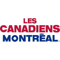
Canadiens Wordmark Logo
The Montreal Canadiens have one of the most recognizable logos in all sports, particularly in relation to the Montreal Canadiens Primary logo. The iconic ‘C’ and hockey stick intertwined with a red, white, and blue color scheme has been around since 1917 when founding owner J. Ambrose O’Brien first introduced it. Since then, the logo has undergone some subtle changes but remains unchanged from its original form.
In the 1934-35 season, the team changed their name to "Les Canadiens" as they were now owned by an English-speaking group that wanted to honor French Canadian heritage; this also marked a shift in their logo design which saw them switch out their old shield logo for an updated version featuring two large letters 'M' & 'C' on either side of a hockey stick crossed with each other forming what is known today as the classic “CH” symbol we know so well today!
Today's modern version still retains much of its original elements while adding more vibrant colors like navy blue and silver accents along with sharper lines making it stand out even more against competitors such as Toronto Maple Leafs or Boston Bruins, who both have similar designs but lack that unique touch only found within Montreal's beloved crest! Overall this timeless emblem continues to be associated not only with Canada's national sport but also serves as a reminder for everyone about how far this historic franchise has come over the last century since being founded back in 1917 - a truly remarkable feat indeed!
Montreal Canadiens
1957 - Present
Double lined wordmark "LES" on top and "CANADIENS" in red with Canadiens logo on top as well.
Font: Unknown
Montreal Canadiens
1953 - Present
Triple lined wordmark "LES" on top and "CANADIENS" in red above "MONTREAL" in blue.
Font: Unknown