Montreal Canadiens
The change to the current logo is again a closed red letter “C,” with its top and bottom edges curling into each other in a symmetrical shape. The “C” and the “H” are fused together. All enclosed by a thick blue outline.
Montreal Canadiens
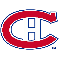
1957 - 2000
In 1957, the logo stayed intact with again modifications to the letter "C." The opening side of the letter "C" is now closed. The red large letter "C" still has a blue outline with the small letter "H."
Montreal Canadiens
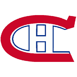
1948 - 1957
The Canadiens did some modifications to the letter "C" in the 1948 logo. The thick blue outline still goes around the logo red large letter "C" and the small letter "H" in white.
Montreal Canadiens
1933 - 1948
The blue trim was thickened all around the logo in 1933, creating a tighter, sharper look. This crest lasted more than a decade.
Montreal Canadiens
1926 - 1933
In 1926 the large "C" shape change slightly and now a blue outline is around the complete logo.

Montreal Canadiens
1923 - 1926
The 1923 logo is the same as the 1921 Canadiens logo with the red letter "C" and a white "H" with blue outline.
Montreal Canadiens
1922 - 1923
The 1922 logo reverted back to the 1918 logo, however the large red letter "C" straightens out on the bottom of the "C" and is flat. The white with blue outline "H" is the same as the original.
Montreal Canadiens
1920 - 1922
The logo in 1920 was the most experimental, the red was darker and the "H" was filled in. This design has a lot more symmetry to it than the logos directly preceding and following it.
Montreal Canadiens
1918 - 1920
The "H" stands for hockey. The crest was changed to represent the new team name, "Le club de Hockey Canadien." The logo features a large red letter "C" with a white letter "H" with blue outline.
Montreal Canadiens
1914 - 1918
The 1912 - 1913 logo is the first bearing much resemblance to today’s logo. The "A" combines with the "C" to represent "CAC". So the "C" is used twice. The logo is a large red letter "C" with a small capitalized red letter "A" with a blue outline.
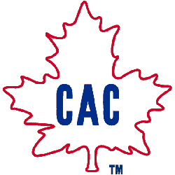
Montreal Canadiens
1913 - 1914
This red, white and blue version from 1911 - 1912 upped the letter count to three "CAC," representing the words Club, Athletique and Canadiens. The white maple leaf with a red outline is surrounding the letters.

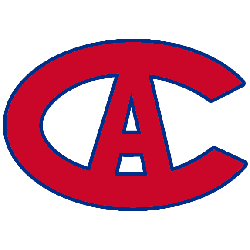
Montreal Canadiens
1912 - 1913
In 1912 the Canadiens changed back to the letter "C." Now a red with blue trim old english letter "C."

Montreal Canadiens
1911 - 1912
The 1911 logo was introduced as a green maple leaf and a white old english "C" which stood for Canadien Athletic.

Montreal Canadiens
1910 - 1911
Montreal’s first logo was very simple. There was no "H" to speak of yet, just a blue stylish "C" to symbolize Club Athletique Canadien. The Canadiens wore it for one season only.
The Legendary Montreal Canadiens Logo
Montreal Canadiens primary logos energize hockey games with bold style. Montreal Canadiens logo history drives designs that spark fan enthusiasm. Furthermore, Montreal NHL logo artwork attracts collectors with sharp detail. Visit the official Montreal Canadiens Wikipedia page. Consequently, fans cherish Canadiens hockey heritage. They celebrate the legendary primary logo identity with excitement.
Sports Fan Products