Edmonton Oilers
The Oilers’ wordmark “OILERS” is in blue in the original custom font, as well as the encompassing blue ring, and the oil drop is orange in the top center. Colors to rematch their original 1979 team colors of royal blue and orange.
Oilers Wordmark Logo
The Edmonton Oilers are one of the most recognizable hockey teams in the world, and their iconic logo has been an integral part of their identity since they were founded in 1972. The original Oilers logo was a blue circle with white trim and two crossed oil derricks. This design served as the team's primary logo until 1996 when it underwent its first significant redesign. In this new version, the crossed oil derricks were replaced by a stylized "EDM" lettering that featured four orange flames emanating from each corner of the lettering to create an overall more modern look for the team's brand identity.
Since then, there have been numerous minor tweaks made to both versions of this classic Oilers mark over time; however, none have changed its core concept or character too drastically – making sure that fans can still recognize their beloved Oiler’s emblem no matter what changes may be made throughout time! One notable change came in 2017 when they unveiled a slightly modified version featuring sharper lines on both “EDM” letters and brighter colors across all elements. This gave way to better visibility even on smaller screens like televisions or smartphones, which is essential given how quickly technology evolves these days!
The Edmonton Oilers wordmark logo has become synonymous with excellence over nearly five decades now - having gone through many iterations but not straying too far away from its roots at any point along the way- thus ensuring that fans will always know who they are cheering for regardless if times change or not! It is clear why people love this timeless symbol so much: while other logos come & go – theirs remains forever etched into our collective memory as one representing true sportsmanship & dedication towards winning championships year after year without fail!
Edmonton Oilers
2023 - Present
A double-lined wordmark "EDMONTON OILERS" in blue.
Slight change to the color blue.
Font: Edmonton Oilers
https://shorturl.at/U6KIk
Edmonton Oilers
2023 - Present
A double-lined wordmark "EDMONTON OILERS" in blue next to primary team logo.
Slight change to the color blue.
Font: Edmonton Oilers
https://shorturl.at/U6KIk
Edmonton Oilers
2018 - 2022
A double-lined wordmark "EDMONTON OILERS" in blue.
Font: Edmonton Oilers
https://shorturl.at/U6KIk
Edmonton Oilers
2018 - 2022
A double-lined wordmark "EDMONTON OILERS" in blue next to primary team logo.
Font: Edmonton Oilers
https://shorturl.at/U6KIk
Edmonton Oilers
2012 - 2017
Wordmark "OILERS" in blue, orange and white and "EDMONTON" above in blue.
Font: Custom
Edmonton Oilers
1997 - 2011
Double lined arched wordmark "OILERS" in blue with gold trim and "EDMONTON" above in blue.
Font: Custom
Edmonton Oilers
1997 - 2011
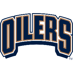
Arched wordmark "OILERS" in blue with gold trim.
Font: Custom