Edmonton Oilers
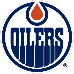
The Oilers’ wordmark “OILERS” is in blue in the original custom font, as well as the encompassing blue ring, and the oil drop is orange in the top center.
Colors to rematch their original 1979 team colors of royal blue and orange.
Oilers Alternate Logo
The first alternate logo for the Edmonton Oilers was introduced in 1979 and featured an orange circle surrounding a white letter “E” for Edmonton inside of it. This classic design was used until 1984, when it was replaced by a more modernized version featuring an oil derrick silhouette set against a bright yellow background that also included two stars at either side of the image representing Alberta’s provincial flag colors—red and white—as well as four stripes running along both sides of it symbolizing Canada's national colors: red, green, gold/yellow, and blue/white respectively.
In 2000 another new alternative logo made its debut featuring three interlocking circles in shades of navy blue, on top of which sat an orange shield containing five stars representing Alberta's founding provinces (Alberta itself being one). In 2007 this same basic concept remained but underwent some slight changes, including changing from navy to dark grey as well as adding silver accents throughout various parts, such as outlining around each star within a said shield or encircling them altogether; furthermore, all five stars were now outlined in silver instead just those located on either end like before making for even greater contrast between them compared to everything else present heretofore not seen since then until today!
Edmonton Oilers
2002 - 2007
A blue oil drop within a silver shield. A wordmark "OILERS" in white with silver highlights and a dark blue outline.

Edmonton Oilers
2002 - 2007
A blue oil drop streaking to the left.

Edmonton Oilers
1996 - 2007
An oil worker pulling a hockey stick lever. Background is a triangle with a large oil pipe.

Edmonton Oilers
1996 - 2007
Oil worker handling a hockey stick. A wordmark "EDMONTON OILERS" in blue on a triangle background.

Edmonton Oilers
1976 - 1978
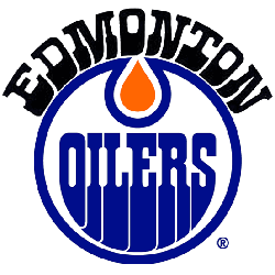
"OILERS" in blue inside a blue circle with orange oil drop and a wordmark "EDMONTON" arched above in black.
Sports Fan Products