Buffalo Sabres
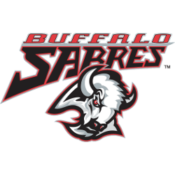
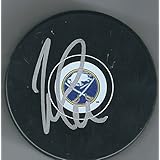
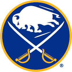
The Buffalo Sabres logo features a white buffalo, a symbol of good luck, leaping in between two crossed sabres on a royal blue circle trimmed in gold. The Sabres first adopted this style of logo for their expansion 1970 – 1971 season, the version is seen here was modified for the 2020 – 2021 season. Differences between this and the original include the elimination of the ear from the buffalo as well as more edges on each of its legs and hooves.

Buffalo Sabres
2021 - Present
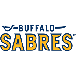
The Buffalo Sabres quietly updated their wordmark logos for the 2021. The new wordmark "BUFFALO" stacked vertically in the new royal blue and "SABRES" in gold, the serifs of the letters designed to mimic the angles and movement of the team's primary logo.
Font: Custom
Buffalo Sabres
2014 - 2020
Double lined wordmark "BUFFALO" in blue with a sabre going through the wordmark and "SABRES" in yellow with a blue outline.
Font: Custom
Buffalo Sabres
2007 - 2013
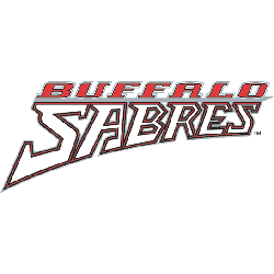
Wordmark "BUFFALO" in silver on top and "SABRES" in yellow with sliver outline.
Font: NHL Sabres by Jayde Garrow
https://www.dafont.com/nhl-sabres.font
Buffalo Sabres
2007 - 2013
Wordmark "BUFFALO" in silver on top and "SABRES" in blue with sliver outline.
Font: NHL Sabres by Jayde Garrow
https://www.dafont.com/nhl-sabres.font

Buffalo Sabres
2007 - 2013
Wordmark "BUFFALO" in yellow on top and "SABRES" in blue.
Font: NHL Sabres by Jayde Garrow
https://www.dafont.com/nhl-sabres.font

Buffalo Sabres
2007 - 2010
A yellow buffalo (primary logo) leaping above the wordmark "BUFFALO" in silver and "SABRES" in blue with silver trim.
Font: NHL Sabres by Jayde Garrow
https://www.dafont.com/nhl-sabres.font

