Buffalo Sabres
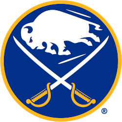
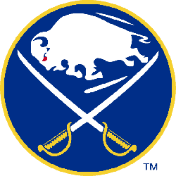
The Buffalo Sabres logo features a white buffalo, a symbol of good luck, leaping in between two crossed sabres on a royal blue circle trimmed in gold. The Sabres first adopted this style of logo for their expansion 1970 – 1971 season, the version is seen here was modified for the 2020 – 2021 season. Differences between this and the original include the elimination of the ear from the buffalo as well as more edges on each of its legs and hooves.
Sabres Primary Logo
The Buffalo Sabres have had a long and varied history with their primary logo. The original logo, introduced in 1970 when the team joined the NHL, featured a white buffalo head on an orange circle with blue trim. This design remained unchanged until 1996, when it was replaced by a new logo featuring two crossed swords behind a charging buffalo in navy blue and gold colors. The following significant change to the primary logo occurred in 2006 when they changed from two swords crossing behind the charging buffalo to one sword running through it while keeping all other elements intact.
Overall, even though there have been several changes over the years, what remains constant is that Buffalo Sabres' primary logos always feature some combination of charging bison/buffalo and cross sword(s); thus providing fans something familiar yet still fresh each time any modifications are made!
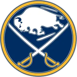
Buffalo Sabre
2011 - 2021
Back to the original logo from 1996 with a modern touch. A white charging buffalo above two white and yellow swords crisscrossed inside a blue circle with silver and yellow trim.
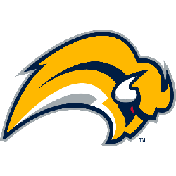
Buffalo Sabre
2007 - 2011
A yellow and navy blue buffalo with a red eye leaping forward. This logo is referred to as the "Buffaslug."

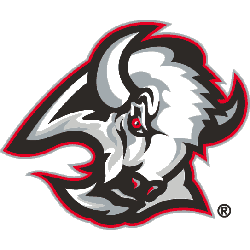
Buffalo Sabre
2000 - 2007
A white, silver, and black buffalo head with a red trim.
The shade of red was adjusted.
Buffalo Sabre
1997 - 2000
A white, silver, and black buffalo head with a red trim.
Buffalo Sabre
1970 - 1997
A blue circle and a yellow trim with a buffalo in white between two white and yellow sabres crossed.
Sports Fan Products


Hey, Sabres Fans - Cast Our Vote!
Click to go to NHL Logo Battle and vote