
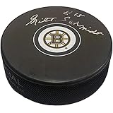
Boston Bruins
A new version of a letter “B” in black trimmed in gold with eight gold spokes within a black circle. Known as the Spoked-B logo.

Boston Bruins
2024 - 2026
It features the modern serifed letter "B" in black, trimmed in gold within a black circle with eight golden spokes.
The Boston Bruins logo was created specifically for their centennial season in 2024.
Boston Bruins
2009 - 2024
The black "B" has a gold outline with a black trim. The yellow spokes are now symmetrical with a bold black border. The thick black circle remains with the gold trim.
The shade of gold was again darkened.

Boston Bruins
2008
The black "B" has a gold outline with a black trim. The yellow spokes are now symmetrical with the bold black border. The thick black circle remains with the gold trim.

Boston Bruins
1996 - 2008
In 1996 the logo made some minor changes, as the black “B” now has the bold yellow trim with a black border. The gold spokes remained, but a black outline was added around the spokes and the “B” was slightly elongated. The think black circle has a gold trim added.

Boston Bruins
1950 - 1996
In 1948 the spoked “B” made its appearance as their logo for the first time. The logo featured a black “B” with yellow trim and 8 yellow spokes that are arranged around the letter “B.” A thick black circle is surrounding the “B.”

Boston Bruins
1935 - 1950
The “B” logo stayed essentially the same, except the letter is colored with black instead of brown and still with a thick yellow border.
Boston Bruins
1933 - 1935
In 1932, the bruin bear was replaced with a brown capital “B” which has a thick yellow outline.
Boston Bruins
1927 - 1933
The Bruins used the same logo from 1924, however they removed the brown background. The font changed for the wordmark 'BOSTON" in brown with yellow border on top and wordmark "BRUINS" in yellow on a square brown background. The brown bruin is the same with a yellow trim.

Boston Bruins
1924 - 1927
In 1925 – 1926 season, a face was put on brown bruin located in the center of the logo. A wordmark “BOSTON” in yellow on top and “BRUINS” in brown on a yellow background.
The Classic Boston Bruins Logo
Boston Bruins primary logos ignite hockey games with classic style. Drawing from Boston Bruins logo history, new Boston Bruins logo designs stir passion in fans. Furthermore, primary logo artwork grabs collectors with clear detail. Visit the official Boston Bruins Wikipedia page. Consequently, fans cherish Bruins hockey heritage, celebrating the team’s classic primary logo identity with enthusiasm.
Sports Fan Products


Hey, Bruins Fans - Cast Our Vote!
Click to go to NHL Logo Battle and vote


