Toronto Maple Leafs
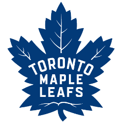
Inspired by the classic Leafs logo of the 1940’s to 1960’s, the club’s new mark has a number of design characteristics that distinguish it. On February 2, 2016, the team unveiled a new logo that will be adopted for 2016 – 2017 season in honor of its centennial; it returns the logo to a form inspired by the earlier designs, with 31 points to allude to the 1931 opening of Maple Leaf Gardens, and 17 veins in reference of its 1917 establishment. 13 of the veins are positioned along the top portion in honor of its 13 Stanley Cup victories.
Toronto Maple Leafs
2011 - Present
Inspired by the classic Leafs logo of the 1940’s to 1960’s, the club’s new mark has a number of design characteristics that distinguish it.
The same leaf for the primary, without the wordmark "TORONTO MAPLE LEAFS."

Toronto Maple Leafs
2001 - 2007
An intertwined letters "TML" in white, blue, and silver. The letters "TML" stand for the team name Toronto Maple Leafs.

Toronto Maple Leafs
1993 - 2000
A blue maple leaf with white details, was worn as the shoulder patch on the team's white home jersey from 1993 - 2000.

Toronto Maple Leafs
1988 - 1992
Blank (no veins) blue leaf on white, worn on the shoulder of the Toronto Maple Leafs road jersey from 1988 through 1992.

Toronto Maple Leafs
1983 - 1987
Blank white leaf on light blue, worn on the shoulder of the Toronto Maple Leafs home jersey from 1982 - 1983 through 1986 - 1987, shade of blue is darkened for 1988.

Toronto Maple Leafs
1971 - 1982
Blank blue leaf on white, worn on the shoulder of the Toronto Maple Leafs road jersey from 1970 - 1971 through 1981 - 1982, replaced with a modernized leaf.

Iconic Toronto Maple Leafs Logo
Sports Fan Products