
Tampa Bay Lightning
The current Lightning logo is a more traditional, simple look that removed the team’s name and city altogether. The circle around the bolt that has always been there remains, while the bolt itself is a crisp, clean look that is easy on the eyes.
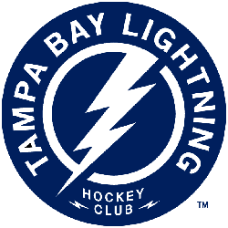
Tampa Bay Lightning
2012 - Present
A blue circle with white lightning bolt inside the circle with wordmark "TAMPA BAY LIGHTNING HOCKEY CLUB" in white. Two small lightning bolts at the bottom.
Tampa Bay Lightning
2008 - 2011
Modernized lightning bolt going through state of Florida on a silver background with white and blue outline.

Tampa Bay Lightning
2002 - 2007
Lightning bolt above blue Florida map with silver background and a blue outline. Blue darkened from previous version.

Tampa Bay Lightning
1993 - 2001
Lightning bolt above blue Florida map with silver background and a blue outline.

Exploring the Evolution of Tampa Bay Lightning Logo History!
In this video, we delve into the rich history and evolution of the Tampa Bay Lightning logo. From its inception to today, witness how this emblem has transformed and evolved, becoming a symbol of tradition and pride for fans. Join us as we uncover the stories behind each design iteration and explore the enduring legacy of the Tampa Bay Lightning logo.
Electric Tampa Bay Lightning Logo