Florida Panthers
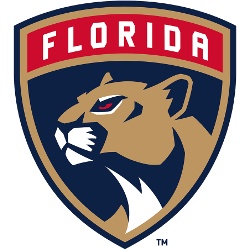
The new Panthers primary logo includes a more mature and stoic panther inside a shield with “Florida” set in a tab across the top of the mark.
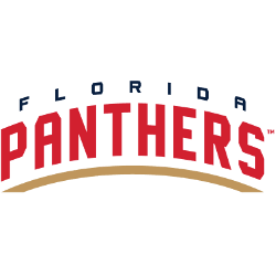
Florida Panthers
2017 - Present
Double lined arched wordmark "FLORIDA" in blue on the top and "PANTHERS" in red with a gold underline.
Font: florida panthers
https://font.download/font/florida
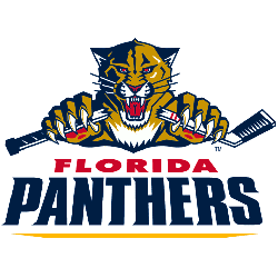
Florida Panthers
2010 - 2016
Panther's primary logo breaking a hockey stick above the wordmark "FLORIDA" in red and "PANTHERS" in blue.
Font: florida panthers
https://font.download/font/florida
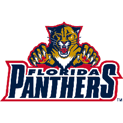
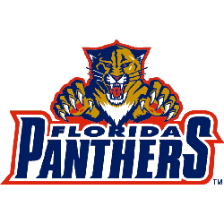
Florida Panthers
2000 - 2009
Panther's primary logo above the wordmark "FLORIDA" and "PANTHERS" in blue with a red outline.
A new shade of red.
Font: florida panthers
https://font.download/font/florida
Florida Panthers
1994 - 1999
Panther's primary logo above the wordmark "FLORIDA" and "PANTHERS" in blue with a red outline.
Font: florida panthers
https://font.download/font/florida
Florida Panthers Logo History: How It Changed Over Time!
A captivating video that takes viewers on a visual journey through the evolution of the Florida Panthers' logo, one of the most recognizable symbols in the National Hockey League (NHL). The video illustrates the progression of the Panthers' logo from its inception in 1993, highlighting the subtle and not-so-subtle changes it has undergone over the years. From the original detailed leaping panther design, the transition to a more simplified, modern look, and back to a reimagined version of the classic leaping panther, each iteration is meticulously analyzed in the context of design trends and the team's history. Whether you're a Panthers fan, a logo design enthusiast, or just a sports fan interested in the intersection of sports and branding, this video offers an intriguing exploration of how the Florida Panthers' logo has evolved, reflecting the team's identity and the changing times.