The Arizona Coyotes logo spearheads the team’s primary logo collection, debuting in 1996 as the Phoenix Coyotes. Its Kachina coyote design reflects Arizona’s Native American heritage. Consequently, the Arizona Coyotes hockey team’s emblem captivates fans, showcasing the Arizona Coyotes logo’s cultural depth and regional pride.
Arizona Coyotes
2022 - 2024
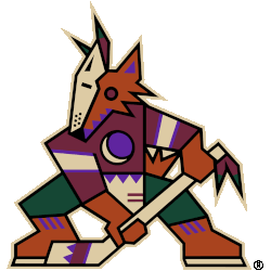
The Kachina logo returns as the Arizona Coyotes ' full-time primary logo. The logo remains the same as it did in the late 1990s, a kachina-doll style coyote posed in the shape of a letter "A" holding a hockey stick.

Arizona Coyotes
2015 - 2022
The primary logo for the Arizona Coyotes is an aggressive coyote howling at the moon. It has a two-tone face with zig-zag black markings down the middle, three pieces of mane leading down to the neck, and triangular markings in the ear and chin. The Arizona Coyotes logo includes four triangles across the snout's bridge, representing the Four Peaks.
Adrenalin Design Group designed the logo.
Iconic Arizona Coyotes Logo
The Arizona Coyotes logo, a Kachina-style coyote in forest green and brick red, anchors the primary logo collection. Introduced in 1996 for the Arizona Coyotes team’s NHL debut, it honors Southwestern culture. Collectors prize its unique design. Additionally, view the Arizona Coyotes Alternate Logo.
The Arizona Coyotes logo energized games, tied to the 1996-2024 NHL era before relocation to Utah. Its vibrant colors echo Arizona Coyotes old logo designs on jerseys, linking fans to the desert’s legacy. Furthermore, its impact endures, as noted on the team’s Wikipedia page.