Pittsburgh Pirates
1928 - 1929
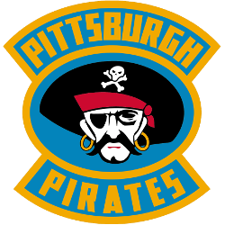
A black, white, red and yellow pirate's head inside a blue background and gold oval with wordmark "PITTSBURGH PIRATES" in yellow on light blue background on top and bottom.
Pirates Alternate Logo
The Pittsburgh Pirates are a professional ice hockey team based in Pittsburgh, Pennsylvania. They are a part of the National Hockey League (NHL) and have played for over a century. The team has a rich history and a loyal fan base, and one of the most recognizable aspects of the franchise is its alternate logo.
The Pirates' alternate logo has undergone several changes, each representing a different era in the team's history. Let's take a trip down memory lane and explore the evolution of the Pittsburgh Pirates' alternate logo.
The first alternate logo for the Pittsburgh Pirates was introduced in 1970. It featured a pirate's head with a red bandana, a gold earring, and a black eye patch. The logo was simple yet effective, and it quickly became a fan favorite. It was used until 1972 when the team introduced a new logo to coincide with their move to the Civic Arena.
The new alternate logo featured a more detailed version of the pirate's head, with a red and gold bandana, a gold earring, and a menacing expression. This logo was used until 1979 when the team underwent a major rebranding. The Pirates changed their name to the Pittsburgh Penguins and introduced a new logo, leaving behind the pirate theme.
In 1992, the team reverted to their original name, Pittsburgh Pirates, and returned the iconic pirate logo. However, the logo had a more modern and sleek look this time. The pirate's head was now wearing a black bandana with a gold trim, and the earring was replaced with a hoop earring. This logo was used until 2002, when the team introduced a new alternate logo to celebrate their 35th anniversary.
The 35th-anniversary logo featured a skull with two crossed hockey sticks behind it. The skull had a red bandana with a gold trim, and the crossed hockey sticks were a nod to the team's history. This logo was used for only one season before the team introduced a new alternate logo in 2003.
The 2003 alternate logo was a modern and edgy version of the classic pirate's head. It featured a more aggressive-looking pirate with a red bandana, a gold earring, and a menacing expression. This logo was used until 2016, when the team introduced a new alternate logo to coincide with their move to the PPG Paints Arena.
Pittsburgh Pirates
1929 - 1930
A pirate's head in black and white with a pirates hat in black oval with a double wordmark "PITTSBURGH" on top and "PIRATES" on the bottom in black.

Pittsburgh Pirates
1928 - 1929
A black letter "P."
Pittsburgh Pirates
1926 - 1928
A slanted black letter "P" in yellow box with black stripes.
Pittsburgh Pirates
1926 - 1928
The Pirates logo is the city of Pittsburgh’s coat of arms logo.
Also used by the Pittsburgh Pirates football team.