Pittsburgh Pirates
1928 - 1929
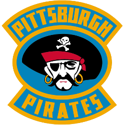
A black, white, red, and yellow pirate's head inside a blue background and gold oval with the wordmark "PITTSBURGH PIRATES" in yellow on a light blue background on top and bottom.
Pirates Primary Logo
The Pittsburgh Pirates have a long and storied history that dates back to their founding in 1887. The team's primary logo has changed several times over the years, but it has always been an iconic symbol of the city of Pittsburgh. From its beginnings as a simple sketch on stationery paper to its current form as one of the most recognizable logos in sports, here is a brief look at how this beloved emblem evolved through time.
When the team was founded in 1887 by William Chase Temple, they adopted his personal crest for their inaugural logo design. This badge featured three diamonds arranged around an anchor with two crossed swords beneath it; all elements were set against a white background and encircled by gold trimming. Although this original design would eventually be replaced due to copyright issues, it still serves as inspiration for numerous modern designs used today including those found on hats or jerseys from various teams across North America’s professional hockey leagues (NHL).
In 1948 when Hall-of-Fame player/coach Frankie McCarron took over management duties he decided to make some changes which included updating their visual identity with something more unique and identifiable than before; thus began what we now know today as “The Jolly Roger” – featuring black lettering spelling out PIRATES above two crossed swords underneath which was placed within an oval shape surrounded again by a gold trimming similar to earlier versions but updated slightly so that each element appeared larger than before making them easier read from afar or even printed onto smaller items such clothing apparel like t-shirts etc… Over time minor tweaks were made such adding stars near either side of these words while also changing colors depending upon usage context (e.g., blue & yellow). Despite these alterations, core elements remained intact throughout decades until finally being retired after the 1995 season when new owners opted instead to go back original version first seen nearly 110 years prior!

Pittsburgh Pirates
1926 - 1928
Slanted letter "P" in black with yellow trim.


