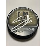
The Vegas Golden Knights logo shines in the team’s wordmark logo collection, debuting in 2017 in the NHL. Its sleek text reflects Nevada’s bold spirit. Therefore, the Vegas Golden Knights history captivates collectors. Moreover, the Las Vegas Golden Knights logo showcases vibrant identity and regional pride.
Vegas Golden Knights
2017 - Present
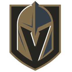
A knight’s helmet with a letter “V” in the negative space using the colors steel grey, gold, and black on top of a black with a gold trim shield.
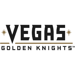
Vegas Golden Knights
2017 - Present
Wordmark "VEGAS" in black with a gold underline, two golden starbursts in reference to the Welcome to Las Vegas sign on either side. Wordmark "GOLDEN KNIGHTS" in black below.
Font: VG Knights
https://fontmeme.com/fonts/vg-knights-font/
Bold Vegas Golden Knights Logo
The Vegas Golden Knights logo, a sharp gold and black “GOLDEN KNIGHTS” wordmark, anchors the wordmark logo collection. Launched in 2017, it honors the NHL Vegas Golden Knights logo heritage. Additionally, collectors love its clean design. Thus, it complements the team’s legacy. Check the Vegas Golden Knights Primary Logo.
The Vegas Golden Knights logo ignites passion at games, tied to the 2017 NHL debut. Its colors echo Las Vegas Golden Knights logo jersey designs. Consequently, it links fans to Nevada’s legacy. Furthermore, its impact endures, per the team’s Wikipedia page.
Sports Fan Products