Pittsburgh Penguins
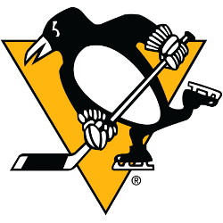
The Penguins released their 50th anniversary logo for the upcoming season, which had not a hint a Vegas gold — a lighter, more metallic color — but instead, featured the Lemieux-era Pittsburgh gold — similar to the gold worn by the Steelers and Pirates, or as some people call it, “yellow.”
Pittsburgh Penguins
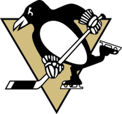
2007 - 2016
A black and white penguin wearing skates, hockey gloves, and holding a hockey stick on a Vegas gold with a black trim triangle.
A new shade of gold.
Pittsburgh Penguins
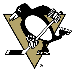
2003 - 2007
In 2002, the Penguins officially reverted to the old logo, but made a change to set it apart. The bright yellow was replaced with a darker “Vegas Gold." Still have the black and white skating penguin holding a hockey stick.

Pittsburgh Penguins
2000 - 2003
A black and white penguin on a yellow and black triangle with two white horizontal lines to the right side indicating movement.
Referred to as the RoboPenguin by fans.
A slight change to the shade of yellow.

Pittsburgh Penguins
1993 - 2000
The new logo shows a black and white penguin on a yellow and black triangle with two white horizontal lines to the right side indicating movement.
Referred to as the RoboPenguin by fans.
Pittsburgh Penguins
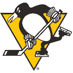
1973 - 1993
In 1971, the lettering and the circle around the logo was removed, leaving a larger black and white skating penguin on his own for the first time. The yellow with black trim in a triangle shape is still in the background.

Pittsburgh Penguins
1969 - 1973
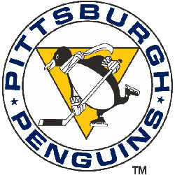
In 1968 the Penguins changed the look of the penguin with his round gut pushed up to his chest to make him look stronger and his facial expressions became a lot more menacing. The circle around the Penguin was also made bolder. A wordmark "PITTSBURGH PENGUINS" in white on a blue ring. The lettering was made larger and turned white, while the background became a dark blue.
Pittsburgh Penguins
1968 - 1969
The first Penguins logo has been labeled “Beer League Penguin” because it’s the only one with a beer gut. This logo has a smile, wide eyes and dangling scarf. A wordmark "PITTSBURGH PENGUINS" in blue enclosed around the penguin. In 1967 Bob Gessner created the first logo for the Pittsburgh Penguins of the National Hockey League. He was paid $1,500 for providing the Penguins with their logo.
The Iconic Pittsburgh Penguins Logo
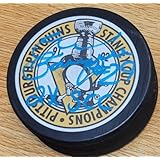
Pittsburgh Penguins primary logos energize hockey games with bold style. Pittsburgh Penguins logo history drives designs that ignite fan passion. Furthermore, the Pittsburgh Penguins symbol attracts collectors with clear detail. Visit the official Pittsburgh Penguins Wikipedia page. Consequently, fans value Penguins hockey heritage. They celebrate the iconic primary logo identity with enthusiasm.
Sports Fan Products
