Ottawa Senators
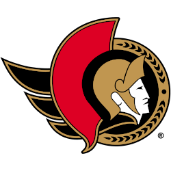
Known as the Senators Centurion logo, this design features the profile of a Roman senator wearing a gold helmet placed inside a black circle. To the left is a red helmet decoration as well as a flowing gold cape, a semi-circle in gold to the right featuring a series of laurel leaves.
The Ottawa Senators used a similar version of this logo until 2007, the color of the cape was changed from red to gold for the 2021 version.
Senators Primary Logo
The Ottawa Senators' primary logo has changed several times throughout the team’s history. The first logo was adopted in the 1992-93 season and featured a large “O” with two crossed swords behind it, representing courage and strength. This design remained until 1997, when a new look was introduced that included an updated shield shape with three stars above it, symbolizing each of the original NHL teams from Canada: Montreal Canadiens, Toronto Maple Leafs, and Ottawa Senators. The next iteration of this logo came in 2007, with an even more modernized version featuring a single star at its center to represent all Canadian hockey teams and their shared heritage.
Overall, these logos have been designed over time for visual appeal and to accurately reflect changes within both organizations (like expansion) and any cultural shifts occurring within society at large too! It's clear why so many people remain loyal supporters despite these continual updates. No matter what happens off the ice, you know that your favorite team will always be represented by something unique yet distinctly "Ottawa Senator" through & through!

Ottawa Senators
2008 - 2021
The Senator's logo is officially the head of a Roman general, a member of the Senate of the Roman Empire, projecting from a gold circle. The logo is slightly more upright, and the additional squint in the eyes makes him more stoic. Mirroring the shift toward visor use in the NHL, his helmet also protects more of his face.

Ottawa Senators
1998 - 2008
The logo underwent a slight transformation, as the wordmark “Ottawa Senators” disappeared in favor of laurels. The rest of the logo did not change.

Ottawa Senators
1993 - 1998
The first real logo debuted in time for Ottawa’s inaugural season in 1992 - 1993. The design was simple, more symbolic than detailed, and represented the Centurion or Roman general figure who connected to the term Senator. The logo is in gold, red and black with Centurion wearing a gold helmet and their are wings out of the back. A wordmark "OTTAWA SENATORS" in black in a semi-circle in front of the face of the centurion.
Sports Fan Products


