New York Rangers
A red, white, and blue shield with the wordmark “NEW YORK” across the top and “RANGERS” slanted across the shield. A new shade of blue.
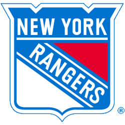
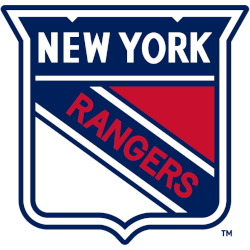
New York Rangers
1979 - 2000
From 1978 to 2000, the Rangers used a couple of elements of the past in a softer blue while remaining true to the previous version.
A new shade of blue again.
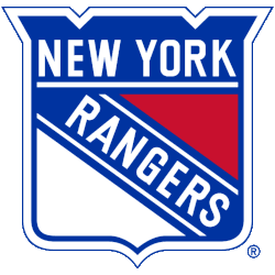
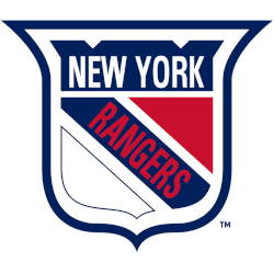
New York Rangers
1972 - 1979
A red, white, and blue shield with the wordmark "NEW YORK" across the top and "RANGERS" slanted across the shield.
The shield size was enlarged.
New York Rangers
1968 - 1972
A blue, red, and white shield with a wordmark "NEW YORK" in white across the top and "RANGERS" diagonally in red on a blue background.
The diagonal wordmark angles changed.
New York Rangers
1953 - 1968
A blue, red, and white shield with a wordmark "NEW YORK" in white across the top and "RANGERS" diagonally in red on a blue background.
The shape of the shield changed again.
New York Rangers
1948 - 1953
A blue, red, and white shield with a wordmark "NEW YORK" in white across the top and "RANGERS" diagonally in red on a blue background.
Widened the shield to be square.
New York Rangers
1927 - 1948
For the original Rangers shield in 1927 there is a blue, red, and white shield with a wordmark "NEW YORK" in white across the top and "RANGERS" diagonally in red on a blue background.
The Iconic New York Rangers Logo
New York Rangers primary logos energize hockey games with bold style. New York Rangers logo history drives designs that ignite fan passion. Furthermore, NHL New York Rangers logo artwork attracts collectors with clear detail. Visit the official New York Rangers Wikipedia page. Consequently, fans value Rangers hockey heritage. They celebrate the iconic primary logo identity with enthusiasm.
Sports Fan Products


Hey, Rangers Fans - Cast Our Vote!
Click to go to NHL Logo Battle and vote


