New York Rangers
2000 - Present
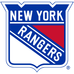
A red, white, and blue shield with the wordmark “NEW YORK” across the top and “RANGERS” slanted across the shield. A new shade of blue.
Rangers Alternate Logo
The New York Rangers have proudly represented the city of New York since 1926, particularly in relation to the New York Rangers Wordmark logo. Throughout their history, they have had many different and alternate logos to represent them. The first alternate logo for the Rangers was introduced in 1976 to celebrate the team's 50th anniversary season. This logo featured an outline of Manhattan with a white "Rangers" script on top and two hockey sticks crossing each other at its center. The design remained unchanged over the years, although some minor adjustments were made in 1996 when it was updated with more modern colors and font styles.
In 2010, after 84 years of using only one primary logo, the Rangers unveiled their second alternate crest—the “Lady Liberty” emblem—in honor of America’s independence from Great Britain during Revolutionary War times (1776-83). This iconic symbol features Lady Liberty standing atop a blue circle encircled by 13 stars representing each original colony state plus Washington D.C., all done up in shades of red/white/blue hues synonymous with American pride & patriotism. As part of this rebranding effort by Madison Square Garden (MSG), both traditional symbols were incorporated into one unified brand identity system, thus creating what would become known as ‘New York Ranger Nation.'
Today there are three main versions used for official branding purposes: 1) A classic version featuring Lady Liberty holding her torch aloft alongside two crossed hockey sticks; 2) A simplified version where only her head appears alongside those same crossed hockey sticks; 3) An even simpler graphic which uses an abstracted representation consisting solely out off two intersecting lines forming an X shape within a circular frame – all done up again in red/white/blue color scheme reminiscent to that found on United States flags across our nation today! All these variations show how versatile yet recognizable this secondary mark has become over time while still maintaining its core symbolic meaning & historical significance behind it - making it a timeless piece of artwork worthy of any true Ranger fan or anyone who loves our great country alike!
New York Rangers
1997 - 2007
Ranger shield in 3D with Statue of Liberty head and the letters "NYR" in red. The letters "NYR" stand for New York Rangers.
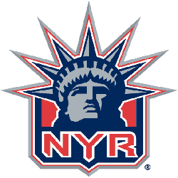
New York Rangers
1997 - 2007
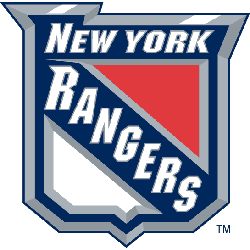
The Rangers primary shield logo modernized with a 3-D effect.