The New York Americans logo shines in the team’s wordmark logo collection, evolving since 1925 in the NHL. Its sleek text reflects New York’s bold spirit. Therefore, the New York Americans logo history captivates collectors. Moreover, the New York Americans hockey emblem showcases vibrant identity and regional pride.
New York Americans
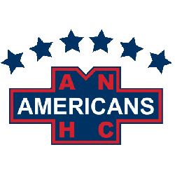
1940 - 1941
Wordmark "AMERICANS" in white on blue background with several letters "ANHC" in red with four blue stars above.
New York Americans
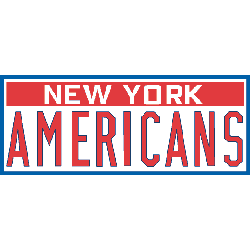
1931 - 1935
Wordmark "AMERICANS" in large red with "NEW YORK" above in white on red, all in cased in a blue border. The car license plate logo.
Font: Custom

New York Americans
1926 - 1930
Wordmark "NEW YORK" in big red letters with "AMERICANS" in small white on blue. A red bar below.
Font: Custom
Bold New York Americans Logo
The New York Americans logo, a sharp red and blue “AMERICANS” wordmark, anchors the wordmark logo collection. Launched in 1925, it honors the New York Americans NHL heritage. Additionally, collectors love its clean design. Thus, it complements the team’s legacy. Check the New York Americans Primary Logo.
The New York Americans logo ignited passion at games, tied to the 1925-1941 NHL era before becoming the Brooklyn Americans. Its colors echo New York Americans hockey jersey designs. Consequently, it links fans to New York’s legacy. Furthermore, its impact endures, per the team’s Wikipedia page.
Sports Fan Products