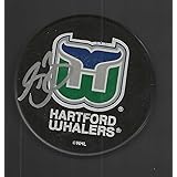
The Hartford Whalers logo shines in the team’s wordmark logo collection, evolving since 1979 in the NHL. Its sleek text reflects Connecticut’s maritime spirit. Therefore, the Hartford Whalers history captivates collectors. Moreover, the Hartford Whalers NHL emblem showcases vibrant identity and regional pride.

Hartford Whalers
1993 - 1997
In 1993 the Whalers made some modern changes to their final logo. A grey background was added that also became the thick border. The darker green "W" now has a white trim and the darker blue whale tale also has white trim.
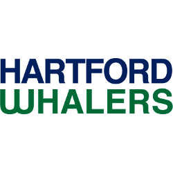
Hartford Whalers
1993 - 1997
Double lined wordmark "HARTFORD" in blue on the top and "WHALERS" in green on the bottom.
Font: Unknown
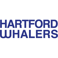
Hartford Whalers
1980 - 1992
Double lined wordmark "HARTFORD" on the top and "WHALERS" in blue on the bottom.
Font: Unknown
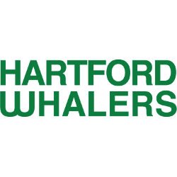
Hartford Whalers
1980 - 1992
Double lined wordmark "HARTFORD" on the top and "WHALERS" in green on the bottom.
Font: Unknown
Nautical Hartford Whalers Logo
The Hartford Whalers logo, a bold green and blue “WHALERS” wordmark, anchors the wordmark logo collection. Launched in 1979, it honors the Hartford Whalers NHL heritage. Additionally, collectors love its clean design. Thus, it complements the team’s legacy. Check the Hartford Whalers Primary Logo.
The Hartford Whalers logo ignited passion at games, tied to the 1979-1997 NHL era before becoming the Carolina Hurricanes. Its colors echo the Hartford Whalers jersey designs. Consequently, it links fans to Connecticut’s legacy. Furthermore, its impact endures, per the team’s Wikipedia page.
Sports Fan Products