Arizona Coyotes
2022 - 2024
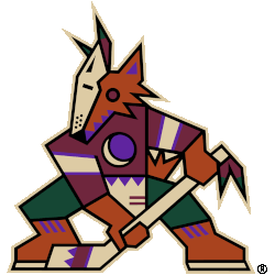
The Kachina logo returns as the Arizona Coyotes ' full-time primary logo. The logo remains the same as it did in the late 1990s, a kachina-doll style coyote posed in the shape of a letter "A" holding a hockey stick.
Arizona Coyotes
2022 - 2024
Returning to their classic Kachina-style logo of the Coyote-head in purple, red, sand, and black.
Arizona Coyotes
2022 - 2024
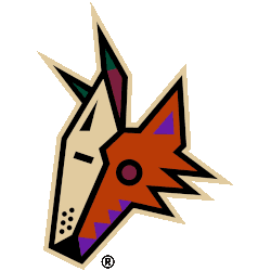
An aggressive coyote howling at the moon. It has a two-tone face with zig-zag black markings down the middle, three pieces of mane leading down to the neck and triangular markings in the ear and chin. The logo includes four triangles across the bridge of the snout, representative of the Four Peaks.
Former primary logo.

Arizona Coyotes
2019 - 2024
A sand colored moon in a purple colored eclipse in the Arizona desert with a wordmark "COYOTES" in brick red with sand trim.
Arizona Coyotes
2019 - 2021
The logo consists of a sienna-colored Coyote wearing half of a sand-colored goalie mask and a brick red hockey jersey with hunter green pants. Clutching a sand hockey stick with a purple crescent moon logo on its chest.
Moved to primary logo again.
Arizona Coyotes
2016 - 2024
The state of Arizona in black with the upper section have the Arizona flag and the letters "AZ" in cream.
Arizona Coyotes
2015 - 2024
A coyote paw print in cream with black trim and the letter "A" in black in the middle. The letter "A" stand for the state of Arizona.
Arizona Coyotes
2015 - 2016
State of Arizona map with half of the state flag in the upper half of the map recolored to match those of the Arizona Coyotes. Below the flag is the state abbreviation of "AZ" in a Copperplate-esque style font.
Arizona Coyotes
2009 - 2024
A sedona red, cream and black coyotes leaping in the air.
