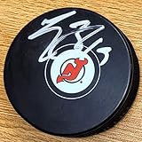
The New Jersey Devils logo shines in the team’s wordmark logo collection, evolving since 1982 in the NHL. Its sleek text reflects New Jersey’s fierce spirit. Therefore, the New Jersey Devils logo history captivates collectors. Moreover, the New Jersey Devils hockey emblem showcases vibrant identity and regional pride.
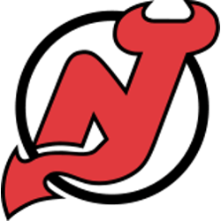
New Jersey Devils
2000 - Present
The Devils’ logo is a monogram of the letters “N” and “J” rendered with devil horns at the top of the “J” and a pointed tail at the bottom. The logo sits inside an open black circle, and lies on a field of white.
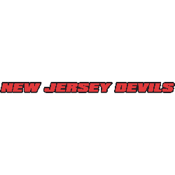
New Jersey Devils
1983 - Present
Single lined wordmark "NEW JERSEY DEVILS" in red with a black trim.
Font: Custom
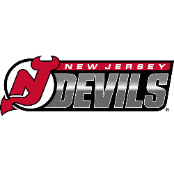
New Jersey Devils
1999 - 2000
The Devil's logo on the left with a double lined wordmark "NEW JERSEY" in white on a red background on top and "DEVILS" in silver on a black background.
Font: Custom
New Jersey Devils
1982 - 1990
Double lined wordmark "NEW JERSEY" in green on top and "DEVILS" in red with a circular pill shaped, used by the Devils' since moving from Colorado.
Font: Custom
Fierce New Jersey Devils Logo
The New Jersey Devils logo, a bold red and black “DEVILS” wordmark, anchors the wordmark logo collection. Launched in 1992, it honors the New Jersey Devils logo png heritage. Additionally, collectors love its clean design. Thus, it complements the team’s legacy. Check the New Jersey Devils Primary Logo.
The New Jersey Devils logo ignites passion at games, tied to the 1992 NHL rebrand. Its colors echo New Jersey Devils hockey jersey designs. Consequently, it links fans to New Jersey’s legacy. Furthermore, its impact endures, per the team’s Wikipedia page.

