The Winnipeg Jets logo fronts the team’s primary logo collection, shining in the NHL from 1972 to 1996 as the original Jets before becoming the Coyotes. Its bold “Winnipeg” and jet design reflect Manitoba’s aviation heritage. Consequently, the Winnipeg Jets logo old captivates fans, showcasing historic pride.

Winnipeg Jets
1991 - 1996
In 1991, the logo changed to a white dominant logo. The jet, now orange, which used to be flying up towards the sky, was now simplified and flew level. A wordmark "WINNIPEG JETS" in blue on a white background. The "J" is still a blue hockey stick, and an orange circle surrounds the logo.
Winnipeg Jets
1979 - 1991
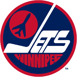
In 1979 the Jets logo featured a jet taking off on a orange circle inside a blue circle with a wordmark "JETS" in white and "WINNIPEG" wordmark below in orange. A white hockey stick is the "J" in the wordmark "Jets."
Bold Winnipeg Jets Logo
The Winnipeg Jets logo, a red "Winnipeg" and white “Jets” with a soaring jet, anchors the primary logo collection. Launched in 1972 for the Winnipeg Jets NHL debut in the WHA, it honors Manitoba’s aviation roots. Collectors prize its dynamic design. Additionally, view the Winnipeg Jets Alternate Logo.
The Winnipeg Jets logo sparked passion at games, tied to the 1972-1996 era before relocating as the Coyotes. Its vibrant colors echo Winnipeg Jets NHL jersey designs, linking fans to the city’s legacy. Furthermore, its impact endures, as noted on the team’s Wikipedia page.