Vancouver Canucks
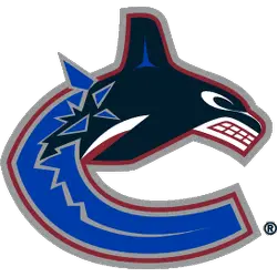
A dark blue, white and grey Orca whale bursting out of the ice in the shape of a letter “C.” The arched “VANCOUVER” wordmark removed for 2019 – 2020 season.
Canucks Primary Logo
The Vancouver Canucks have had a long and storied history with their primary logo. The team was founded in 1970, and the original logo featured an “Orca” whale wearing a hockey helmet. This logo was used until 1997, when it underwent its first significant change. The new version of the Orca featured more detail, including two crossed hockey sticks behind him meant to represent the spirit of competition associated with professional sports teams like the Canucks.
Today’s version is still based on these earlier designs. Still, it has been modernized over time, with subtle changes made here or there throughout each season to keep up with current trends within professional sports branding circles. Overall, it can be said that despite slight modifications every few years, the Vancouver Canuck’s iconic primary Logo remains essentially unchanged since being introduced back in 2007, providing fans everywhere something familiar yet continuously fresh-looking all at once!

Vancouver Canucks
2008 - 2020
They kept the orca whale logo but changed the team’s colors to match the original 1970 - 1971 look. The wordmark "VANCOUVER" was added to the chest area above the orca. The "C" represents the nickname of the team Canucks.

Vancouver Canucks
1998 - 2008
In 1997 the Canucks unveiled a new logo, in which a Haida style orca whale breaking out of a patch of ice forms a stylized "C". The logo has been much maligned, accused of being a blatant reference to their parent company, Orca Bay, now Canucks Sports and Entertainment. The letter "C" stands for the team nickname Canucks. The "C" represents the nickname of the team Canucks.

Vancouver Canucks
1993 - 1998
A wordmark "CANUCKS" in a diagonal slant as part the skate blade of a black, orange, and gold skate inside a black and orange circle.
Referred to as the "Flying Skate."
A new shade of red.

Vancouver Canucks
1979 - 1993
The new logo consisted of the wordmark "CANUCKS" in a diagonal slant as part the skate blade of a black, orange, and gold skate inside a black and orange circle.
Referred to as the "Flying Skate."

Vancouver Canucks
1971 - 1979
North Vancouver’s Joe Borovich hit the nail on the head with his "Stick in Rink" design for the very first Vancouver Canucks NHL logo. The blue and green color combination connect well and the stick that breaks up the oval makes the logo into a “C” formation for Canucks.
Sports Fan Products


