
Utah Hockey Club
The Utah Hockey Club logo, used temporarily only for their inaugural season, showed UTAH in sizeable black lettering within a Mountain Blue circle with HOCKEY CLUB surrounding it in white and outlines of black and blue around the circle. The Utah Hockey Club used this simple name and logo due to the relatively short turnaround between getting the franchise in the Spring of 2024 and their first game for the team just four months later.
Utah HC Primary Logo
The Utah Hockey Club, formerly known as the Arizona Coyotes, has a rich and interesting history when it comes to their primary logo. The team's logo has undergone several changes over the years, but one thing has remained constant - the fierce and intimidating coyote that has become synonymous with the franchise. The original logo, which was introduced in 1996, featured a snarling coyote head with a hockey stick in its mouth. This logo represented the team's aggressive and competitive nature on the ice, and it quickly became a fan favorite.
The Utah Hockey Club's primary logo has become more than just a symbol for the team; it has become a representation of their identity and values. The fierce and determined coyote remains a prominent feature in the logo, representing the team's unwavering determination and resilience on the ice. The incorporation of the letter "U" and the colors of the Utah state flag showcases the team's pride in their new home and their commitment to the community. The logo has evolved over the years, but one thing remains constant - it represents the spirit and passion of the Utah Hockey Club.
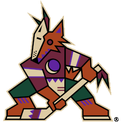
Arizona Coyotes
The Kachina logo returns as the Arizona Coyotes full-time primary logo. The logo remains the same as it did in the late 1990s, a kachina-doll style coyote posed in the shape of a letter “A” holding a hockey stick.
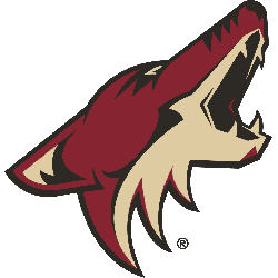
Arizona Coyotes
2015 - 2022
The primary logo for the Arizona Coyotes is an aggressive coyote howling at the moon. It has a two-tone face with zig-zag black markings down the middle, three pieces of mane leading down to the neck, and triangular markings in the ear and chin. The Arizona Coyotes logo includes four triangles across the snout's bridge, representing the Four Peaks.
Adrenalin Design Group designed the logo.
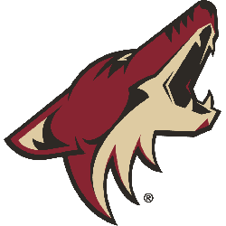
Phoenix Coyotes
2004 - 2014
In 2003 - 2004, the Coyotes introduced a much cleaner, less experimental design to represent the team. The color scheme was simplified to a brick and tan and the logo is way less busy than the hectic design that came before it.
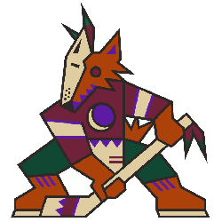
Phoenix Coyotes
2000 - 2004
In 1999 the logo remained same with a darker shade of brick red and removed the wordmark "Phoenix Coyotes." The coyote image is much larger.
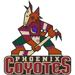
Phoenix Coyotes
1997 - 2000
When first designing the logo, artist Greg Fisher was actually asked to stay away from something menacing and instead focus on embracing the Southwest culture in an attempt to make the Arizona residents feel the team truly belonged to them. The logo consists of a sienna-colored Coyote wearing half of a sand-colored goalie mask and a brick red hockey jersey with hunter green pants. Clutching a sand hockey stick with a purple crescent moon logo on its chest.

Winnipeg Jets
1991 - 1996
In 1991 the logo changed to white dominate logo. The jet now orange which used to be flying up towards the sky, was now a simplified and flew level. A wordmark "WINNIPEG JETS" in blue on a white background. The "J" is still a blue hockey stick and the logo is surrounded by a orange circle.

Winnipeg Jets
1979 - 1991
In 1979 the Jets logo featured a jet taking off on a orange circle inside a blue circle with a wordmark "JETS" in white and "WINNIPEG" wordmark below in orange. A white hockey stick is the "J" in the wordmark "Jets."
Sports Fan Products
