Quebec Nordiques
1986 - 1995
The final logo again featured a red with white and blue outline in the shape of the letter “n” and a red hockey stick as the entrance to the igloo. A blue hockey puck is on top of the hockey stick.
Removed the wordmark from the previous logo.
Nordiques Primary Logo
The Quebec Nordiques were a professional ice hockey team that played in the National Hockey League (NHL) from 1979 to 1995. The franchise was based out of Quebec City, Canada, and had many memorable moments during its tenure in the NHL. One of the most iconic aspects of this franchise was its primary logo, which saw several iterations over its 16-year history.
The first iteration appeared when they joined the NHL for their inaugural season in 1979 and featured an abstract version of a snowflake with two crossed hockey sticks inside it surrounded by blue trimming on top and bottom with “Quebec” written across it horizontally at center. This design remained relatively unchanged until 1987 when they changed to a more modern look featuring an updated snowflake logo surrounded by red trimming on top and bottom along with black lettering spelling out “Nordiques” at the center instead of just “Quebec” like before.
In 1994, prior to leaving for Colorado as part of what would become known as "the Avalanche," they made one final change to their primary logo which kept many elements from previous versions but incorporated some new ones such as white stars behind both sides of the crossed sticks while also adding additional colors including yellow into the mix making it appear even more modern than before yet still maintaining that classic feel associated with this beloved organization since day one back in 1979 all those years ago now gone but not forgotten thanks largely due these iconic logos used throughout the time spent there giving us something tangible we can remember them fondly by today long after last puck dropped within confines walls Le Colisee home sweet home so many memories forever etched hearts minds everywhere!
Quebec Nordiques
1986 - 1986
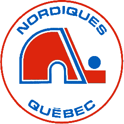
The Nordiques started out with their famous red igloo logo. The red with white and blue outline in the shape of the letter "n" and a red hockey stick is the entrance to the igloo. A blue hockey puck is on top of the hockey stick. A wordmark "NORDIQUES" on top in blue and "QUEBEC" in blue on the bottom. All enclosed in a red circle.
Sports Fan Products