Philadelphia Flyers
2000 - Present
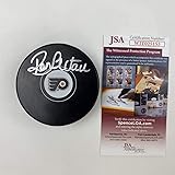
A black P-Wing with an orange circle in the middle. The Flyers classic orange and black winged-P that oozes hard-nosed hockey and harkens back to the Broad Street Bullies days. The letter “P” stands for the city of Philadelphia.
Flyers Alternate Logo
The Philadelphia Flyers have had a long and storied history, including the use of alternate logos, particularly in relation to the Philadelphia Flyers Wordmark logo. The original logo was created in 1967 by artist Sam Ciccone and featured an orange circle with white wings on either side. This logo was used until 1974 when it was replaced by a new design featuring two crossed hockey sticks, still used today as the team's primary logo.
In 1995, the Flyers introduced their first-ever alternate jersey to commemorate their 30th anniversary season. It featured an updated version of Ciccone’s original design from 1967 but with different colors – black for the wings instead of white and gold for the circle instead of orange – along with “Flyers” written across it in script lettering. This jersey remained in use until 2007, when it was retired after 10 years due to declining popularity among fans who preferred more modern designs such as those seen on other teams around that time period, like Pittsburgh Penguins or Detroit Red Wings jerseys.
Since then, several new alternate logos have been released over time; most recently being unveiled during last year's 50th-anniversary celebration, where they debuted a classic retro-inspired look reminiscent of what players wore back during their inaugural season in 1967–68 while also incorporating elements from both past (the winged P) and present (the addition of gold accents). Each one has helped to ensure that no matter how often things change within this organization, its iconic identity remains intact throughout all eras - something that will continue to be celebrated well into future generations!
Philadelphia Flyers
2003 - 2007
A 3-D version of the Flyers primary logo. A black P-Wing with an orange circle in the middle. The letter "P" stands for the city of Philadelphia.

Philadelphia Flyers
2000 - Present
Slight variation of primary logo. A black P-Wing with an orange circle in the middle. The letter "P" stands for the city of Philadelphia.

Philadelphia Flyers
1983 - 1999
Slight variation of primary logo. A black P-Wing with an orange circle in the middle. The letter "P" stands for the city of Philadelphia.

Sports Fan Products