New York Islanders
Initials “NY” in white on blue with an orange outline circle with a hockey stick and puck and a map of Long Island below in orange. Four stripes added to the hockey stick represent four Stanley Cups.
Islanders Primary Logo
The New York Islanders have had a long and storied history, and their primary logo has changed many times over the years. The first iteration of the team’s logo came in 1972 when they were initially known as the New York Americans. This original design featured a red, white, and blue shield with an American eagle and two crossed hockey sticks behind it.
Finally, in 1998, after several minor changes throughout those three years prior, A brand new look was unveiled featuring what is now considered one of the most recognizable logos in sports today: An orange fisherman silhouette that would become affectionately known simply as "Fisherman." Even though slight modifications have been made since then, such as changing out some colors or altering how certain elements are presented, the basic idea remains unchanged even up till the present day making Fisherman one of the most iconic symbols associated with not just Islanders but the entire National Hockey League itself!
New York Islanders
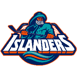
2011 - 2018
Classic New York Islanders logo updated with four pieces of tape on hockey stick - each piece represents an Islanders Stanley Cup victory
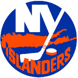
New York Islanders
1999 - 2011
The original logo is brought back, and the only change to the classic logo is its colors; as the team had replaced its original royal blue with navy, the logo was recolored to match. The letters "NY" stand for the city of New York.
New York Islanders
1998 - 1999
Initials "NY" in white in a blue circle with a map of Long Island below in orange.
Temporary one-year-only logo created to quickly replace the infamous Fisherman logo in 1997.
New York Islanders
1996 - 1998
Before the 1995 - 1996 season, the Islanders attempted to update their look. The result was the unveiling of a logo depicting a fisherman in a teal pancho and hat holding a striped hockey stick. A wordmark "ISLANDERS" in white with orange bottom border. A hockey net in the background.
New York Islanders
1973 - 1996
An advertising executive named John Alogna from East Meadow created the original version of the Islanders logo with the "NY" over a silhouette of part of Long Island, Nassau and Suffolk counties. Part of the "Y" is made to resemble a hockey stick, with three orange stripes near the bottom of the shaft and a puck located to the right of the stick blade. The Tip of the "I" ends in a point aimed at Uniondale, Nassau County, representing where the team's home arena is located above the "Islanders" name at the bottom. The letters "NY" stand for the city of New York.
Sports Fan Products


Hey, Islanders Fans - Cast Our Vote!
Click to go to NHL Logo Battle and vote