Mighty Ducks of Anaheim
2000 - 2007
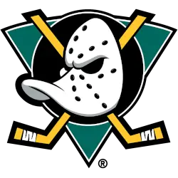
A duck-billed goalie mask in white with black holes and silver highlights on a jade green with white and black trim triangle, a black with a white trim circle, and two crossed hockey sticks in gold with thicker black trim.
A thicker black outline around the hockey sticks and black trim added to the triangle.
Mighty Ducks Wordmark Logo
The Mighty Ducks of Anaheim have a long and storied history, dating back to their inception in 1993. The team was founded by the Walt Disney Company, who named it after the popular movie franchise "The Mighty Ducks," which had just released its third installment. As such, they adopted an iconic logo featuring an anthropomorphic duck wearing a hockey helmet and holding a hockey stick over his shoulder - one that has become synonymous with the team and the sport itself.
Since then, this logo has been through several iterations as owners changed hands from Disney to Henry Samueli in 2005 until its current owner: The Blackstone Group in 2019. Throughout all these transitions, however, there remains one constant: That same original wordmark logo which features “Mighty Ducks of Anaheim” written out across two lines above said cartoon duck image below it, A symbol of not only how far this franchise has come but also how much more successful they are today than when first established nearly three decades ago.
Today's version is slightly different from what was used initially due to minor changes made over time, such as font changes or slight color adjustments here & there. However, even still, you can see where those roots began with that classic design remaining intact throughout all these years – making for an instantly recognizable emblem signifying strength & resilience no matter what comes their way!
Mighty Ducks of Anaheim
1994 - 2006
Double lined wordmark "MIGHTY" on top and "DUCKS" in bold colored eggplant.


