Cleveland Barons
1976 - 1978
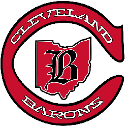
The state of Ohio with a black olde english letter "B" on top of the state. The letter "C" is maroon, with a black outline engulfing the state. Wordmark "CLEVELAND" in white on top of the letter "C" and wordmark "BARONS" in white on the bottom.
Barons Primary Logo
The Cleveland Barons are a professional ice hockey team based in Ohio, and they have been part of the National Hockey League since 1976. The primary logo for the team has gone through several iterations over its history, each one reflecting changes to both its playing style and its identity as an organization.
The original logo featured a red shield with two crossed swords on it, along with a white outline of Lake Erie at the bottom. This symbolized strength and power while also representing Cleveland's location near the water. It was used from 1976 until 1992 when it was replaced by another design featuring an eagle perched atop an orange circle surrounded by stars - this time emphasizing freedom and patriotism rather than physical might or geographical location.
Finally in 1998, after some experimentation with other designs such as using only text-based logos or incorporating elements from other sports teams like baseball’s Indians into theirs, the current version we see today made its debut: A bold black letter “C” that stands out against either blue or white backgrounds depending on where it is being displayed (such as jerseys). This simple yet effective symbol conveys confidence while still referencing back to earlier versions which makes them instantly recognizable even today despite all the years that have passed since then!
Cleveland Barons
1976 - 1978
The state of Ohio with a black olde english letter "B" on top of the state. The letter "C" is maroon, with a black outline engulfing the state. Wordmark "CLEVELAND" in white on top of the letter "C" and wordmark "BARONS" in white on the bottom.
Sports Fan Products