The Atlanta Thrashers logo shines in the team’s wordmark logo collection, debuting in 1999 in the NHL. Its sleek text reflects Georgia’s bold spirit. Therefore, the Atlanta Thrashers history captivates collectors. Moreover, the Atlanta Thrashers symbol showcases vibrant identity and regional pride.

Atlanta Thrashers
2000 - 2011
The original Thrashers logo featured a brown thrasher, who is actually Georgia’s state bird. This logo is a Brown Thrasher holding a hockey stick inside a navy blue and light blue shield.
Atlanta Thrashers
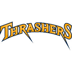
2009 - 2011
Single lined arched wordmark "THRASHERS" in yellow with a blue trim and white highlights.
Font: Custom

Atlanta Thrashers
2000 - 2011
Brown thrasher bird holding hockey stick inside blue shape shield with team wordmark below "ATLANTA" on top in orange with yellow trim and "THRASHERS" in blue with yellow trim.
Font: Custom
Atlanta Thrashers
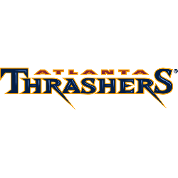
2000 - 2011
Wordmark "ATLANTA" on top in orange with yellow trim and "THRASHERS" in blue with yellow trim.
Font: Custom
Bold Atlanta Thrashers Logo
The Atlanta Thrashers logo, a sharp blue and bronze “THRASHERS” wordmark, anchors the wordmark logo collection. Launched in 1999, it honors the Atlanta Thrashers draft history legacy. Additionally, collectors love its clean design. Thus, it complements the team’s heritage. Check the Atlanta Thrashers Primary Logo.
The Atlanta Thrashers logo ignited passion at games, tied to the 1999-2011 NHL era before relocating to Winnipeg. Its colors echo Atlanta Thrashers symbol jersey designs. Consequently, it links fans to Georgia’s legacy. Furthermore, its impact endures, per the team’s Wikipedia page.
Sports Fan Products