Anaheim Ducks
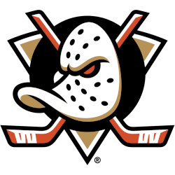
A duck’s goalie mask in white with black holes and gold highlights on a black oval has a single orange eye, the two orange with white highlights crossed hockey sticks with white tape, and the entire logo is placed on a gold triangle trimmed in white and black.
It is the original Mighty Ducks design but recolored in gold, orange, and black.
Ducks Primary Logo
The Anaheim Ducks have a long and storied history when it comes to their primary logo. The first logo was unveiled in 1993 when the team was founded as the Mighty Ducks of Anaheim. It featured an angry-looking duck wearing a jagged hockey helmet with crossed hockey sticks behind him. This design remained unchanged until 2006 when the team rebranded itself as simply "Anaheim Ducks". At this time, they changed their logo to feature an abstract webbed foot with three feathers on top of it—the colors were also changed from black and purple to orange and black.
Today's version continues these changes but has further refined them even more by making small adjustments such as removing one feather from atop its head or thinning out certain lines along its beak or wings for example; all these details help make sure that no matter what era you are looking at - whether it’s 1993 or 2020 - you can always recognize who is represented whenever seeing “that Duck” (as fans affectionately call him).

Anaheim Ducks
2014 - 2025
The current Ducks logo, the D-Foot simplified the previous logo that came before it in 2007 - 2013. Rather than spelling out the whole team name, the webbed "D" of the prior logo was enlarged and made a logo unto itself.

Anaheim Ducks
2011 - 2014
A wordmark "DUCKS" in gold with white trim and orange highlights with the letter "D" in wordmark shaped like the webbed foot of a duck on a black with silver trim background. A wordmark "ANAHEIM" in black above the other wordmark.
Changed the color of the gold.

Anaheim Ducks
2007 - 2011
A wordmark "DUCKS" in gold with white trim and orange highlights with the letter "D" in wordmark shaped like the webbed foot of a duck on a black with silver trim background. A wordmark "ANAHEIM" in black above the other wordmark.
Mighty Ducks of Anaheim
2000 - 2007
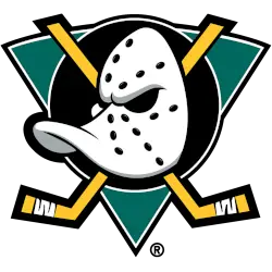
A duck-billed goalie mask in white with black holes and silver highlight on a jade green with white and black trim triangle, a black with white trim circle, and two crossed hockey sticks in gold with thicker black trim.
A thicker black outline around the hockey sticks and black trim added to the triangle.

Mighty Ducks of Anaheim
1994 - 2000
A duck-billed goalie mask in white with black holes and silver highlight on a jade green with white trim triangle, a black with white trim circle, and two crossed hockey sticks in gold with black trim.
Sports Fan Products

Hey, Ducks Fans - Cast Our Vote!
Click to go to NHL Logo Battle and vote
Anaheim Ducks Logo History: From Mighty Ducks to Present!
We explore the changes and milestones that have defined the team's identity. Learn about the inspiration behind each logo redesign and how the Anaheim Ducks have visually represented their brand over the years. Whether you're a die-hard fan or just curious about logo design, this video offers an in-depth look at the Anaheim Ducks' logo history.


