The New York Mets wordmark logo collection celebrates the team’s vibrant MLB legacy. Featuring bold skyline-inspired script, the New York Mets logo fuels team spirit. This collection highlights team history, uniting fans with the dynamic heritage of New York Mets baseball.
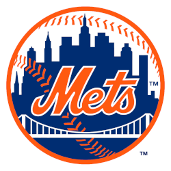
New York Mets
1999 - Present
A scripted wordmark, “Mets” trimmed in white, was placed upon a blue skyline of New York. The buildings on the Mets logo are a generic church spire, the Williamsburgh Savings Bank, the Woolworth Building, the Empire State Building, and the United Nations. A white bridge and the orange stitches of a baseball are placed in front of the skyline. The initials “NY” insignia on the left side was removed.
New York Mets
1962 - Present
Single lined slanted wordmark "Mets" scripted in blue with an orange outline.
Font: Spills Base by Comicraft
https://www.myfonts.com/fonts/comicraft/spills/regular/
The Iconic New York Mets Logo
A bold skyline-inspired script shapes the New York Mets logo in this vibrant wordmark collection. Team history blends classic styles with urban appeal, reflecting the Mets’ unique identity. Fans cherish New York Mets logo PNG designs for their crisp look. Additionally, check the New York Mets Primary Logo. It offers unique designs for collectors. These logos spark fan enthusiasm, embodying the team’s spirited legacy daily.
Alternate New York Mets logos energize baseball games with metropolitan flair. Drawing from New York Mets logo history, logo wallpaper designs evoke passion among supporters. Furthermore, logo PNG artwork captivates collectors with sharp detail. Visit the official New York Mets Wikipedia page. Consequently, fans embrace New York Mets baseball heritage, celebrating the team’s iconic identity with spirited enthusiasm.

