Brooklyn Dodgers
1945 - 1957
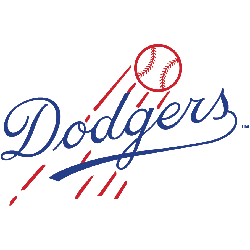
Scripted wordmark "Dodgers" in blue in front of a red flying baseball with streaks.
Dodgers Primary Logo
The Brooklyn Dodgers' primary logo has a long and storied history. It is an iconic symbol of the team’s past successes and future aspirations, as well as being one of the most recognizable logos in professional sports. The original Brooklyn Dodger logo was created in 1913 when they were still known as the “Robins”. This design featured a robin perched atop a baseball bat with its wings spread out to form an arch above it, which symbolized strength and power for their team name at that time.
In 1932, after changing their name to “Dodgers” from Robins due to public opinion about birds being associated with losing teams, they unveiled their new primary logo featuring interlocking letters B-R-O-O-K representing each letter of "Brooklyn". This design remained unchanged until 1947 when it was updated slightly by adding blue trim around the edges making them stand out more prominently against white backgrounds or light colors used on uniforms or other promotional items such as hats etc.
Today's version has been tweaked several times since then but remains largely similar to what fans saw back in 1947; two large capital letters B & D intertwined together forming one big shape that represents both unities between players & fans alike while also paying homage to its roots going all way back over 100 years ago! With this classic look still intact today - there's no doubt why so many people recognize this beloved emblem wherever they go!
Brooklyn Dodgers
1938 - 1945
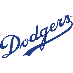
Slanted scripted wordmark "Dodgers" in blue with an underscore.
Brooklyn Dodgers
1937 - 1938
A block letter "B" in green.
Brooklyn Dodgers
1932 - 1937
An old fashioned letter "B" in navy blue.

Brooklyn Dodgers
1912 - 1913
The corners of the baseball field are connected, the logo was a little bigger, and the team was now called the Brooklyn Dodgers, eliminating the name "Trolley."

Brooklyn Trolley Dodgers
1911 - 1912
The team logo carried over from the logo in 1910, as the team was now called the Brooklyn Trolley Dodgers.

