Kansas City Royals
The initials for Kansas City, “KC” on blue shield with gold crown.
Royals Primary Logo
The Kansas City Royals have a long and storied history, dating back to 1969 when the team was founded. Throughout their existence, they’ve had several different logos that represent the city and its baseball heritage. The primary logo of the Royals has gone through many changes over time, but it has always been an important part of their identity.
The first version of the logo featured a royal blue crown with white trim on top of a shield-shaped like an “R” for Royalty or Royals. This design remained in place until 1992 when it was replaced by an updated version featuring two crossed bats in front of another shield with red trimming around it; this design also included three stars above each bat representing past World Series wins (1985-1987). In 2008, yet another update occurred which saw more modernized elements such as sharper edges on both shields and bolder colors added to make them look more contemporary while still maintaining their classic roots from before.
Today's iteration is much simpler than previous designs; now only one shield is present without any stars or other details aside from some thin lines outlining its shape along with KC written inside for “Kansas City” at center stage surrounded by gold accents all around giving off regal vibes befitting something worthy enough to represent such proud franchise as theirs! No matter what form they take though these logos will always be associated closely together due to how deeply entrenched they are within history not just locally but nationally too - so no matter where you go if someone sees your shirt sporting those iconic symbols there won't be any doubt about who you root for!
Kansas City Royals
2002 - 2019
The 2002 logo features the letter link "KC" on a blue shield with gold crown over blue wordmark "Royals." The "R" on the shield was removed.

Kansas City Royals
1993 - 2002
Only change to the 1993 logo is the change from a yellow second tone to now a gold second tone.
Kansas City Royals
1986 - 1993
The scripted wordmark "Royals" is now larger and sticking out on both sides of the crown. The crown has not changed, but again smaller.
Kansas City Royals
1979 - 1986
In 1979, the Royals logo made slight changes. The scripted wordmark below the crown "Royals" is now in blue. The blue and yellow crown has become smaller.
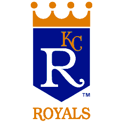
Kansas City Royals
1969 - 1979
The task to create the team logo was assigned to Hallmark Cards, based in Kansas City since 1910. They assigned the job to 15 artists. The winning artist was Shannon Manning a White Sox fan at the time. A package designer at Hallmark, Manning’s now-familiar crown logo embraced the dominant corporate branding style of the late ’60s, a relatively simple visual featuring minimal typography, enclosed within a bold, graphic geometric shape. Contemporary and striking, Manning’s work holds up remarkably well today.
Baseball Sports Fan Products
The Kansas City Royals have been a part of the MLB League for decades, and now they can take part in the MLB Logo Battle. Every fan should show their support by voting on their favorite team logo to help decide which one is deemed as “the best” in all of Major League Baseball! Show your Royals pride and cast your vote today!


