Texas Rangers
A letter “T” in red with a transparent outline and a royal blue drop shadow.
Rangers Primary logo
The Texas Rangers' primary logo is one of the most iconic symbols in all professional sports. It has been around since the team's inception in 1972 and remains a beloved symbol among fans to this day. The logo was created by designer Richard Evans, who wanted to create something that would capture the spirit and history of Texas while also being easily recognizable.
The original design featured an outline of a cowboy on horseback set against a background with five stars representing each state within the Lone Star State - Texas, Oklahoma, Arkansas, Louisiana, and New Mexico. This classic design has seen some minor tweaks over time such as changing colors or adding more detail but it still remains largely unchanged from its original conception nearly 50 years ago.
It is clear why this logo continues to be so popular after all these years; it captures everything great about Texas culture: independence, strength, and resilience which are values that can be shared by everyone regardless if they’re from inside or outside “the lone star state”! It serves as an excellent reminder for fans everywhere that no matter what challenges we face we should always strive for greatness just like our beloved Rangers do every game day!
Texas Rangers
2003 - 2024
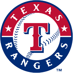
A red and blue ring contains a baseball inlaid in a circle. “TEXAS RANGERS” in white encloses the baseball, which contains the team’s script letter “T” in red with a blue drop shadow.
Designed by Skilo Brands.
Texas Rangers
1994 - 2003
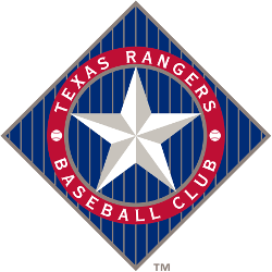
The 1994 logo changed to a diamond-shaped with vertical sliver pinstripes. A large star representing Texas, the Lone Star State, is the dominant feature of this logo. The wordmark is "TEXAS RANGERS BASEBALL CLUB" encircling the star in white with two small baseballs.

Texas Rangers
1984 - 1994
This logo also featured the outline of the state of Texas in blue with a white and red outline, but the large "T" and "R" were dropped. In its place, a wordmark script "Rangers" in red was written across the center in cursive. The white with red seams baseball is also visible, but placed behind the "Rangers."
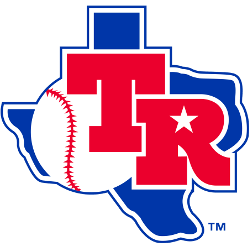
Texas Rangers
1982 - 1984
The shape of the state of Texas in blue along with a red large "T" and "R" with a white star are distinct features of this logo. The baseball from the previous logo is present, but in the background and under the two dominant letters.
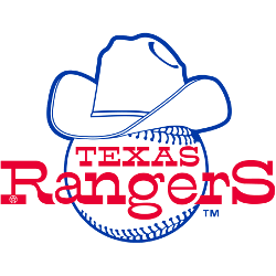
Texas Rangers
1981 - 1982
The slightly modified Texas Rangers' logo features a large white with blue trim cowboy hat on top of a white with blue seams baseball to represent the state's history of cowboys and frontier. The "TEXAS Rangers" wordmark in the middle of the baseball is also represents a "western feel."
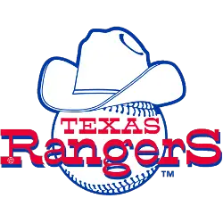
Texas Rangers
1972 - 1981
The first logo of the Texas Rangers features a large white with blue trim cowboy hat on top of a white with blue seams baseball to represent the state's history of cowboys and frontier. The "TEXAS Rangers" wordmark in the middle of the baseball is also represents a "western feel."
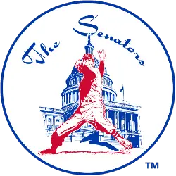
Washington Senators
1961 - 1971
The first logo in the history of the Washington franchise lasted for 10 years until the team departed for Texas in 1972. It features a black Capitol building behind a pitcher throwing to the plate. A scripted wordmark "The Senators" at the top in black.
The Texas Rangers are one of the teams participating in MLB's League Teams Logo Battle! Fans can vote for their favorite logos and show their support for the team. With some of baseball's most iconic designs up against each other, it promises to be an exciting competition that will showcase why Major League Baseball is so beloved by fans around the world. Show your Ranger pride and cast your vote today!


