Minnesota Twins
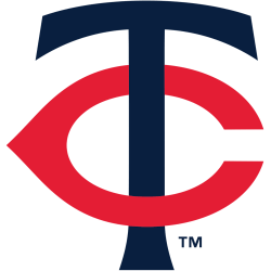
A navy blue letter “T” interlocking with a red letter “C,” the two letters stand for Twin-Cities, the nickname for Minneapolis and St. Paul.
This logo is an updated to the original initials “TC” logo used by the Twins from 1961 through 2022; the serifs at the end of the letter “T” have changed, the letter “C” is much smaller, and the shade of blue has been darkened.
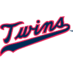
Twins Wordmark Logo
The Minnesota Twins have been a staple of American baseball since their inception in 1901. The iconic Twins logo has gone through many iterations over the years, but it has remained largely unchanged. The original logo featured an M with two crossed bats and a ball in the middle, representing both the team’s initials as well as its sport. Since then, minor changes have been made to make it more modern and recognizable while still retaining its classic shape and design elements.
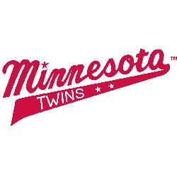
In 1987, the team changed its name from “Twins” to “Minnesota Twins” and adopted a new wordmark logo featuring three stars on either side of an italicized font reading ‘MINNESOTA TWINS'. This was meant to represent not only where they were located (the state of Minnesota), but also how far they had come since their creation 86 years prior—from small-town beginnings to becoming one of Major League Baseball's most successful franchises. In 2000 this version was updated slightly when red trim was added around each letter for additional emphasis; however, this change did not alter any other aspects of the design itself or detract from its overall aesthetic appeal.
Today, the current official wordmark features white letters outlined by navy blue on top that is set against a bright red background —a color combination that serves as an homage to both traditional colors associated with baseball teams (blue & white) as well as being representative of Minnesotan pride(red). Although there may be slight variations depending upon what context it is used in, all versions remain faithful to keeping alive their original concept and intent: To honorably pay tribute to those who helped create such an amazing franchise that continues today after 120+ years!
Minnesota Twins
2010 - 2023
Wordmark "Twins" in red with a navy blue outline and an underscore highlighting the letters "win."
Font: Quadrat Serial Bold
https://deltafonts.com/minnesota-twins-font/
Minnesota Twins
1987 - 2009
Double lined wordmark "MINNESOTA" in navy blue above the wordmark "Twins" in red with blue outline and an underscore highlighting the letters "win."
Font: Quadrat Serial Bold
https://deltafonts.com/minnesota-twins-font/
Minnesota Twins
1987 - 2009
Wordmark "Twins" in red with a navy blue outline and an underscore highlighting the letters "win."
Font: Quadrat Serial Bold
https://deltafonts.com/minnesota-twins-font/

