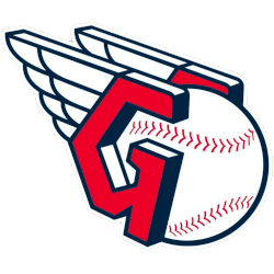
Cleveland Guardians
A letter “G” in red with blue trim and shadowing placed on either side of a white, red and blue baseball, the letters placed to resemble a split-finger fastball grip. A set of blue and white wings are on the back of the letters as a nod to the Guardians of Traffic statues outside the stadium.

Cleveland Indians
2014 - 2021
A new direction for the Cleveland Indians logo as they replace the native American with a block letter "C" in red. This logo is very similar to the 1904 logo of the Cleveland Bluebirds. The letter "C" represents the city of Cleveland.
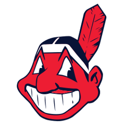
Cleveland Indians
1979 - 2014
In 1979 the logo was slightly alter with a blue outline added replacing the black outline.
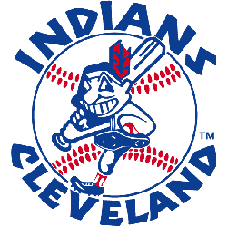
Cleveland Indians
1973 - 1979
In 1980 the logo was slightly alter with a blue outline added replacing the black outline.
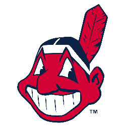
Cleveland Indians
1949 - 1973
In 1949, the mascot was redesigned with a smaller nose, black hair and red skin instead of yellow skin with one feather. The logo has a black outline. This logo has remained in use ever since, with only minor changes to the design till 2014.
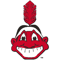
Cleveland Indians
1948 - 1949
Chief Wahoo facing straight ahead, a red Native American cartoon head grinning with a red feather sticking out the back of his black hair.
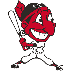
Cleveland Indians
1946 - 1948
In 1947, the Indians added a baseball player's body to the native American head. The native American has a red face with black hair and one red feather. He is in a hitting stance holding a baseball bat.
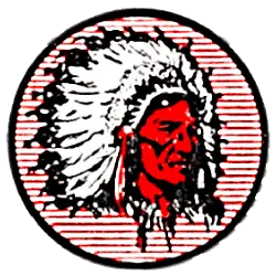
Cleveland Indians
1939 - 1946
The next image of an native American is on a red and white striped circled background. The native American has a red face with a white and black headdress.
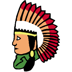
Cleveland Indians
1933 - 1939
A line drawing of a native American with black hair, green shirt, and headdress in white, yellow and red.

Cleveland Indians
1929 - 1933
New design of a native American with a red face and black outlines for facial features. Wearing a white with black outline headdress.
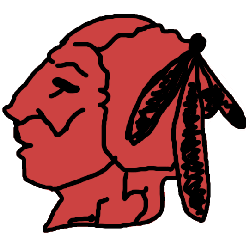
Cleveland Indians
1928 - 1929
The first logo of a native American with three feathers in red with a black outline.

Cleveland Indians
1921 - 1928
In 1921 the Indians logo changed to a font that is similar to Bruce Double Pica in the color blue. The letter "C" represents the city of Cleveland.

Cleveland Indians
1915 - 1921
The Indians first logo is a block letter "C" in a thick blue color. The letter "C" represents the city of Cleveland.

Cleveland Naps
1909 - 1914
The Naps final logo is again a scripted letter "C" with a thicker blue lettering. The letter "C" represents the city of Cleveland.

Cleveland Naps
1906 - 1909
A new scripted letter "C" in blue. A little more curly at the top the letter "C." The letter "C" represents the city of Cleveland.

Cleveland Naps
1905 - 1906
The Naps logo was a scripted letter "C" in blue. The letter "C" represents the city of Cleveland.
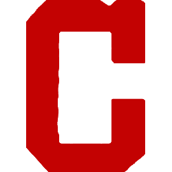
Cleveland Blues
1903 - 1904
Final Blues logo is a letter block "C" now in red. The letter "C" represents the city of Cleveland.
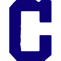
Cleveland Blues
1902 - 1903
The Bluebirds change to a block letter "C" in blue. The letter "C" represents the city of Cleveland.
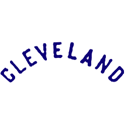
Cleveland Blues
1901 - 1902
Like most teams before the 1900's the logo was just a wordmark of the city "CLEVELAND."
The Dynamic Cleveland Guardians Logo
In MLB games, the Cleveland Guardians primary logo sparks fan pride. Tied to Cleveland Guardians logo history, its bold look suits Cleveland Guardians logo transparent files. Moreover, it reflects team spirit. Visit the official Cleveland Guardians MLB page for details on the team’s legacy, roster, and current season updates.
"Step Up to the Plate in Style!"
Don't get caught looking—score the latest 2026 City Connect jerseys, authentic on-field caps, and limited-edition vintage threads. Officially licensed gear for every true fan of the game.
Hit a Home Run – Shop MLB Official Gear
