Seattle Pilots
1969 - 1970
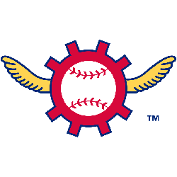
The Pilots only logo is symbolized by a pair of pilots wings flanking a ship captain's wheel with a white baseball and red seams hub bearing the wordmark "pilots" located in the center of the baseball. The emblem is tri-color in design with a gold wings, red wheel, blue letters and blue outline.
Pilots Alternate Logo
The Seattle Pilots were a Major League Baseball team located in Seattle, Washington. The team was founded in 1969 and lasted only one season before the franchise relocated to Milwaukee, Wisconsin, and became the Brewers. Despite their short tenure, they left behind an interesting alternate logo history that is still remembered today.
The first alternate logo for the Pilots featured two baseballs with wings on them flying through an “S” shaped cloud formation that resembled both a “P” and an anchor shape at once. This was meant to represent both the city of Seattle as well as its maritime roots while also being symbolic of flight – something very appropriate considering it was used by an aviation-themed baseball team! It wasn't until after their relocation that this design would become popularized when it appeared on merchandise related to Milwaukee's new MLB franchise: The Brewers!
Today, this original design can be seen all over memorabilia from various teams around Major League Baseball including hats or shirts featuring logos inspired by those worn during games played by either side back then – even though they weren't officially adopted until much later down the line. It's amazing how such a simple concept has been able to stand out among so many other designs throughout history; proving just how powerful nostalgia can be when it comes to creating lasting impressions within sports culture!
Seattle Pilots
1969 - 1970
Yellow winged Pilot's red wheel with a white baseball inside the wheel.
A part of the primary logo with the wordmark.


