
New York Highlanders
1909 - 1912
It wasn't until 1909 that the team changed to the familiar interlocking NY that would be the team logo long after the team became known as the Yankees. The interlocking NY was originally designed by Louis C. Tiffany.
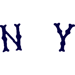
New York Highlanders
1908 - 1909
A new font style, again with distance between the olde English letters "NY" in a dark blue. The letters "NY" represent the city of New York.
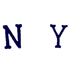
New York Highlanders
1907 - 1908
Different font with the distance between letters. Use of an olde English letter "NY" in a darker blue. The letters "NY" represent the city of New York.
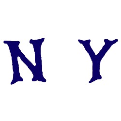
New York Highlanders
1906 - 1907
New font used with a greater distance between the letters. An olde English style letter of "NY" in a lighter blue. The letters "NY" represent the city of New York.
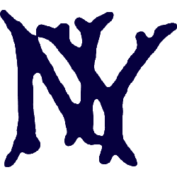
New York Highlanders
1905 - 1906
A new style of old english letters "NY" in a darker blue. The letters "NY" represent the city of New York.
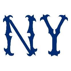
New York Highlanders
1904 - 1905
In 1904 the team used the same font with a change in color to blue. The letters "NY" represent the city of New York.
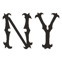
New York Highlanders
1903 - 1904
The first logo for the Highlanders is an old english letters "NY" in the color brown. The letters "NY" represent the city of New York.
The Iconic New York Highlanders Logo
The New York Highlanders logo energized early MLB games. Rooted in New York Highlanders history, it adorned New York Highlanders hats, captivating fans. Furthermore, its design, later iconic for the Yankees, inspires collectors. Visit the official New York Yankees MLB page. Discover the team’s legacy and updates. Consequently, fans embrace Highlanders tradition.
"Step Up to the Plate in Style!"
Don't get caught looking—score the latest 2026 City Connect jerseys, authentic on-field caps, and limited-edition vintage threads. Officially licensed gear for every true fan of the game.
Hit a Home Run – Shop MLB Official Gear
