New York Mets
1999 - Present
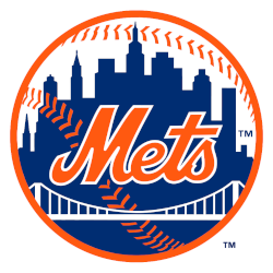
A scripted wordmark, “Mets” trimmed in white, was placed upon a blue skyline of New York. The buildings on the Mets logo are a generic church spire, the Williamsburgh Savings Bank, the Woolworth Building, the Empire State Building, and the United Nations. A white bridge and the orange stitches of a baseball are placed in front of the skyline. The initials “NY” insignia on the left side was removed.
Mets Alternate Logo
The New York Mets have had a long and storied history with their alternate logos, particularly in relation to the New York Mets Wordmark logo. The team was founded in 1962, and since then they've gone through several iterations of an alternate logo. In the early days, the Mets used a simple black-and-white circular logo featuring the word “Mets” inside an orange circle surrounded by blue stars. This was replaced in 1975 with another classic design that featured two interlocking letters “N” and “Y” for New York along with red stripes on either side to represent baseball's most iconic city.
In 1997, as part of Major League Baseball's expansion into new markets like Arizona and Tampa Bay, teams were allowed to create secondary logos which could be used on merchandise or field graphics during games throughout the season - this is when we saw some truly creative designs from all around baseball! For example, The Mets unveiled their first true "alternate" logo which featured a cartoonish looking apple (a nod to NYC's nickname 'the Big Apple') atop its own NY cap resting atop home plate; this design has become one of the fans' favorites over time due it being so unique compared to other teams' more traditional looks at that time period!
Today, while there are still several variations of both primary & secondary logos floating around out there today - none have been able to quite capture what made those original designs special back in 1997 when they were first unveiled; however, if you look closely enough you can still see hints here & there where modern-day versions take inspiration from those beloved originals! So no matter how much things change over time within the MLB branding world – it'll always be nice knowing that deep down underneath all these years later traces remain intact paying homage towards our beloved NY Metropolitans franchise...
New York Mets
2014 - Present
Wordmark "Mets" in blue with orange trim.
Primary logo wordmark.
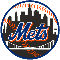
New York Mets
1999 - 2013
Black New York skyline with the Brooklyn bridge in white in the foreground. A white with red stitches baseball in the background with a blue border.
Primary logo with the black city-scape.
