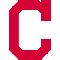
Cleveland Indians
2014 - 2021
A new direction for the Cleveland Indians logo as they replace the native American with a block letter "C" in red. This logo is very similar to the 1904 logo of the Cleveland Bluebirds. The letter "C" represents the city of Cleveland.
Indians Primary Logo
The Cleveland Indians Primary Logo has been a part of the team’s identity since its inception in 1901. The original logo featured an Indian Chief wearing a headdress with feathers and beads, along with two crossed baseball bats behind him. This design was used for nearly 50 years until 1948 when it was replaced by an updated version that included only one bat and the word “Indians” written across the top of it. In 1951, this logo was further updated to include three white stars above the text and a red script “Cleveland” underneath, which is still used today as their primary logo.
In addition to these changes over time, there have also been some minor variations on how certain elements are displayed within this iconic image such as different colors or font styles for "Indians" or "Cleveland". For example in 1978-1979 they added orange outlines around both words while in 1987-1990 they changed them back to black before returning them again to orange from 1991-1994 before finally settling on blue after 1995 up until the present day. These subtle modifications help keep things fresh while maintaining tradition at the same time!
Overall Cleveland Indians Primary Logo has gone through several iterations throughout its history but remained largely unchanged since 1951 when three stars were added above the text and the red script “Cleveland” beneath it – making sure everyone knows who we're talking about: The beloved Tribe! From little tweaks like color scheme or font style all way up to major overhauls; fans can always count on seeing familiar faces representing their favorite team whenever take the field come game day!
Cleveland Indians
1979 - 2014
In 1980 the logo was slightly alter with a blue outline added replacing the black outline.
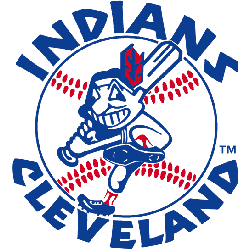
Cleveland Indians
1973 - 1979
After its introduction, the face of the 1951 logo was incorporated into other, full-body depictions of the character. The native american with one red feather is swinging a bat and striding forward on top of a baseball with red seams. The wordmark is "INDIANS" on top of the baseball and "CLEVELAND" on the bottom of the baseball in blue.
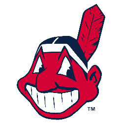
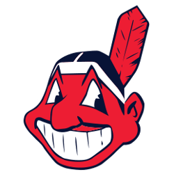
Cleveland Indians
1949 - 1973
In 1951, the mascot was redesigned with a smaller nose, black hair and red skin instead of yellow skin with one feather. The logo has a black outline. This logo has remained in use ever since, with only minor changes to the design till 2014.
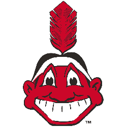
Cleveland Indians
1948 - 1949
Chief Wahoo facing straight ahead, a red Native American cartoon head grinning with a red feather sticking out the back of his black hair.
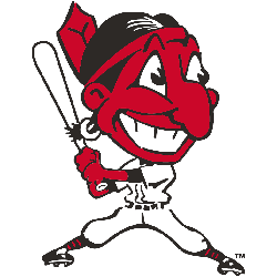
Cleveland Indians
1946 - 1948
In 1947, the Indians added a baseball player's body to the native American head. The native American has a red face with black hair and one red feather. He is in a hitting stance holding a baseball bat.
Cleveland Indians
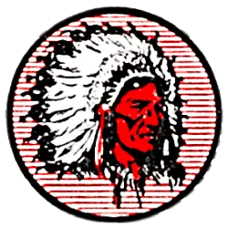
1939 - 1946
The next image of an native American is on a red and white striped circled background. The native American has a red face with a white and black headdress.
Cleveland Indians
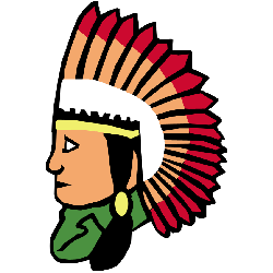
1933 - 1939
A line drawing of a native American with black hair, green shirt, and headdress in white, yellow and red.

Cleveland Indians
1929 - 1933
New design of a native American with a red face and black outlines for facial features. Wearing a white with black outline headdress.
Cleveland Indians
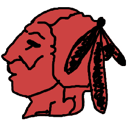
1928 - 1929
The first logo of a native American with three feathers in red with a black outline.

Cleveland Indians
1921 - 1928
In 1921 the Indians logo changed to a font that is similar to Bruce Double Pica in the color blue. The letter "C" represents the city of Cleveland.

Cleveland Indians
1915 - 1921
The Indians first logo is a block letter "C" in a thick blue color. The letter "C" represents the city of Cleveland.
Baseball Sports Fan Products