San Diego Padres
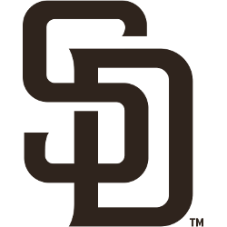
For the 2020 season, the Padres unveiled a new color for their primary logo, featuring the interlocked initials “SD” in brown.
Padres Primary Logo
The San Diego Padres are an iconic baseball team with a long and storied history. The Padres have had several different primary logos throughout the years, each of which has played a role in shaping the identity of this beloved franchise. In this essay, we will explore the history behind some of these classic logos and how they have evolved over time to become part of San Diego's cultural heritage.
The first logo used by the Padres was unveiled shortly after their inaugural season in 1969; it featured a blue-and-gold shield with two crossed bats at its center, along with “San Diego” written across it in white letters. This logo remained largely unchanged until 1984 when an updated version was introduced that included more vibrant colors as well as enlarged text for “San Diego” and “Padres” beneath the shield itself. This new design would last until 1990 when yet another update occurred; this one replaced most elements from before while still maintaining some familiarity through its use of navy blue lettering on top of yellow background coloration for both words beneath the shield image itself (which now featured three stars instead).
In 2004, after 15 years of using essentially identical designs since 1990, another major change took place: gone were all references to "San Diego" or even "Padres", replaced instead by just one word - "SD". Accompanying this single-letter abbreviation was also a new font style that gave off more modern vibes than anything seen previously on any prior versions ever created for use by San Diegans' favorite baseball team! Fast forward to today where you can find variations upon variations within the same overall theme but all having been derived from the original 1969 concept – making sure everyone knows who is playing the ball down south on Pacific Coast League every summertime!
San Diego Padres
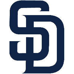
2015 - 2020
For the 2016 season, the Padres unveiled a new primary logo, featuring the interlocked initials "SD" in midnight blue. They have removed the roundel along with the wordmark.
San Diego Padres
2012 - 2015
For the 2012 season, the Padres unveiled a new primary logo, featuring the initials "SD" inside a navy blue circle with the words "SAN DIEGO PADRES BASEBALL CLUB" adorning the outer circle.
San Diego Padres
2011 - 2012
The "SAN DIEGO" has been removed from the top right corner of the logo for the 2011 season.

San Diego Padres
2004 - 2011
The logo was completely changed when the team changed stadiums between the 2003 - 2004 seasons, as the logo now looks similar to home plate with "SAN DIEGO" written in sand font at the top right corner and the "Padres" new wordmark written completely across the center. The white, blue and navy blue waves finish the bottom of the plate.

San Diego Padres
1992 - 2004
The Padres changed their logo for the third time in three years, again by switching colors of the ring. The logo became a white ring with fewer stripes in the center and a darker blue "PADRES" wordmark with orange shadows.
San Diego Padres
1991 - 1992
In 1991, the logo was changed to a silver ring with the "PADRES" wordmark changing from brown to blue.
San Diego Padres
1990 - 1991
In 1989, the Padres took the wordmark "PADRES" logo that was used from 1985 - 1988 and put it in a tan ring that read "SAN DIEGO Baseball Club" with a striped center.
San Diego Padres
1986 - 1990
The Padres removed the wordmark that were on top and bottom of the scripted "PADRES" in brown with an orange trim.
San Diego Padres
1985 - 1986
In 1985, the Padres switched to using a script-like logo in which "PADRES" was written sloped up. A wordmark in a different font "SAN DIEGO" on top and "BASEBALL CLUB" on the bottom.

San Diego Padres
1969 - 1985
The Padres first logo depicts a friar swinging a bat with Padres written on top of the baseball bat. A yellow circle is all around the "swinging friar" and a wordmark is below "SAN DIEGO PADRES" in brown.
Baseball Sports Fan Products
As a San Diego Padres fan, I'm excited to take part in the MLB League Teams Logo Battle! It's an opportunity for fans of all teams to come together and vote on which team has the best logo. With so many iconic designs, it's sure to be a great competition. Let's show our support for our Padres by voting today!


