Minnesota Twins
A navy blue letter “T” interlocking with a red letter “C,” the two letters stand for Twin-Cities, the nickname for Minneapolis and St. Paul. This logo is an updated to the original initials “TC” logo used by the Twins from 1961 through 2022; the serifs at the end of the letter “T” have changed, the letter “C” is much smaller, and the shade of blue has been darkened.
Minnesota Twins
2010 - 2023
Wordmark "Twins" in red with blue trim and underscore highlighting of "win" with blue and gold on a baseball inside a navy blue circle and a white and navy blue outline reading "MINNESOTA BASEBALL CLUB."
Minnesota Twins
1994 - 2010
A red with blue and white trim scripted wordmark "Twins" and with underscore highlighting "win" on a white with red seams baseball. On top of the baseball is a wordmark "MINNESOTA" in blue.
The shade of navy blue was updated.
Minnesota Twins
1987 - 1994
The Twins logo in 1987, featured a red with blue and white trim scripted wordmark "Twins" and with underscore highlighting "win" on a white with red seams baseball. On top of the baseball is a wordmark "MINNESOTA" in blue.

Minnesota Twins
1976 - 1987
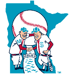
The twins Minnie and Paul shaking hand over the Mississippi river with "Win! Twins!" in red on top of a white with red seams baseball. The state of Minnesota is now a dark blue.
Minnesota Twins
1961 - 1976
Illustrator Ray Barton 1930 - 2010 created the iconic image of Twins "Minnie" and "Paul" wearing baseball uniforms bearing the initials of Minneapolis and St. Paul shaking hands over the Mississippi river on a light blue design of the state Minnesota late in 1960. Whatever the case, Griffith decided to turn the drawing into the team’s official logo. Barton was paid $15 for his artwork.

Washington Senators
1957 - 1960
A caricature of a U.S. Senator winding up to throw a pitch and a wordmark of the team name "SENATORS" behind on blue and red circle. Washington Monument also in the background.
Washington Senators
1955 - 1957
The U.S. Capitol Dome busting out of a baseball and a blue baseball cap and a white baseball bat, worn for final two seasons using Nationals name and first two using Senators name which is why it is shown twice...

Washington Nationals
1953 - 1955
The U.S. Capitol Dome busting out of a baseball and a blue baseball cap and a white baseball bat, worn for final two seasons using Nationals name and first two using Senators name which is why it appears on this site twice...
Washington Nationals
1948 - 1953
A navy blue with red trim letter "W."

Washington Nationals
1938 - 1948
A navy blue letter "W."
Washington Nationals
1936 - 1938
A navy blue with thick red trim letter "W."

Washington Nationals
1905 - 1936
A navy blue letter "W."

Washington Nationals
1901 - 1905
A navy blue letter "W."
Minnesota Twins Logo History: The Journey Unfolded
Explore the captivating evolution of the Minnesota Twins logo, from its humble beginnings to its iconic status in the world of sports. Join us as we uncover its secrets and delve into the rich tapestry of Twins' history. Whether you're a devoted fan or fascinated by design, this journey guarantees enlightenment and inspiration. Get ready for an unforgettable adventure through time and tradition.
The Timeless Minnesota Twins Logo
The Minnesota Twins logo energizes MLB games. Rooted in Minnesota Twins logo history, it honors the old Minnesota Twins logo. Furthermore, Minnesota Twins logo PNG files thrill collectors. Visit the official Minnesota Twins MLB page. Learn the team’s past, roster, and updates. Consequently, fans feel the Twins’ pride.
