Kansas City Royals
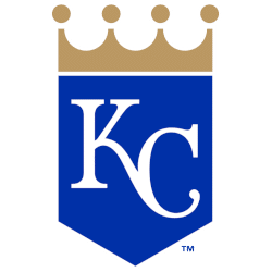
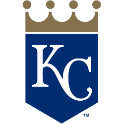
An connected initials “KC” in white placed on a blue royal banner (which also happens to be in the shape of a home plate) with a gold crown above it. Changed their shade of blue and gold.
Kansas City Royals
2019 - 2026
The initials for Kansas City, “KC”, on a blue shield with a gold crown.
Moved from a alternate logo in 2019.
Kansas City Royals
2002 - 2019
The 2002 logo features the letter link "KC" on a blue shield with gold crown over blue wordmark "Royals." The "R" on the shield was removed.

Kansas City Royals
1993 - 2002
Only change to the 1993 logo is the change from a yellow second tone to now a gold second tone.
Kansas City Royals
1986 - 1993
The scripted wordmark "Royals" is now larger and sticking out on both sides of the crown. The crown has not changed, but again smaller.
Kansas City Royals
1979 - 1986
In 1979, the Royals logo made slight changes. The scripted wordmark below the crown "Royals" is now in blue. The blue and yellow crown has become smaller.
Kansas City Royals
1969 - 1979
The task to create the team logo was assigned to Hallmark Cards, based in Kansas City since 1910. They assigned the job to 15 artists. The winning artist was Shannon Manning a White Sox fan at the time. A package designer at Hallmark, Manning’s now-familiar crown logo embraced the dominant corporate branding style of the late ’60s, a relatively simple visual featuring minimal typography, enclosed within a bold, graphic geometric shape. Contemporary and striking, Manning’s work holds up remarkably well today.
The Regal Kansas City Royals Logo
The Kansas City Royals logo stands tall in MLB games. Rooted in Kansas City Royals logo history, the Royals KC logo inspires fans. Additionally, Kansas City Royals logo PNG files delight collectors. Visit the official Kansas City Royals MLB page. Learn about the team’s legacy, roster, and updates.
Baseball Sports Fan Products
