St. Louis Cardinals
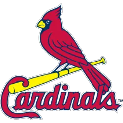
In 1998, the “birds on the bat” was updated for the first time in 30 years with more detailed bird and bolder letters. The new single red with navy blue outline cardinal has a yellow beak with white eyes. The scripted wordmark “Cardinals” in red with a navy blue trim is a much bolder lettering, continuing with the letter “C” locked up over the baseball bat.
St. Louis Cardinals
2024 - Present
A fleur-de-lis in gold with blue and white trim, the Gateway Arch in navy blue with a white outline over it, and the city initials "STL" in red with white trim are all within a red circle trimmed in white and blue.
The St Louis Cardinals City Connect.

St. Louis Cardinals
1998 - Present
A red cardinal perched on a yellow bat looking left.
St. Louis Cardinals
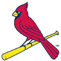
1998 - Present
A red cardinal perched on a yellow bat looking right.
St. Louis Cardinals
1967 - 1997
New design of a cartoon red cardinal with a black face and yellow bill swinging a yellow baseball bat.
St. Louis Cardinals
1960 - 1964
A red cardinal holding a white baseball and with a cap and glove in a pitching stance. A white with black seamed baseball as the background.

St. Louis Cardinals
1956 - 1997
A red and blue cardinal in a batting stance, batting left handed.
St. Louis Cardinals
1949 - 1959
A red cardinal holding a white baseball and with a cap and glove in a pitching stance.
St. Louis Cardinals
1948 - 1955
A red cardinal perched on a yellow bat with navy and yellow outlines.

St. Louis Cardinals
1929 - 1948
Two red and black cardinals perched on a white with black trim bat between wordmark "Cardinals" in red.

St. Louis Cardinals
1927 - 1945
A red cardinal perched on a reddish with black trim bat.
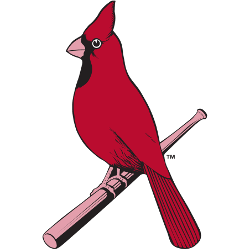
St. Louis Cardinals
1926 - 1927
Interlocking letters "STL" in red. Worn on Cardinals jersey sleeve in 1926.

St. Louis Cardinals
1917 - 1918
Interlocked letters "SL" in red. Worn on jersey sleeve in 1917.

St. Louis Cardinals Logo Story: From Past to Present!
Explore the fascinating journey of the St. Louis Cardinals logo through time! From its humble beginnings to its current iconic status, the St. Louis Cardinals logo has undergone numerous changes, reflecting the team's evolving identity and heritage. This video delves into the history, design inspirations, and key moments that have shaped the logo into what it is today. Whether you're a die-hard Cardinals fan or a logo design enthusiast, this video offers a deep dive into the legacy of one of baseball’s most recognizable emblems.
The Vibrant St. Louis Cardinals Logo
Alternate Cardinals logos energize St. Louis Cardinals logo baseball games with flair. Rooted in Cardinals logo history, these designs spark fan passion. Furthermore, St. Louis Cardinals logo PNG files captivate collectors with timeless appeal. Visit the official St. Louis Cardinals page. Discover the franchise’s legacy. Consequently, fans embrace the enduring Cardinals tradition.


