Cardinals Wordmark Logo
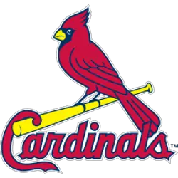
The St. Louis Cardinals are one of the most iconic teams in Major League Baseball, and their wordmark logo has been a part of that identity since 1922, particularly in relation to the St. Louis Cardinals Primary logo. The original design featured an interlocking “SL” with a cardinal perched atop the lettering, which was designed by Miller Huggins, who managed the team from 1918-1929. This initial version lasted until 1934 when it was replaced by a script font version that had more detail and resembled calligraphy writing more closely than its predecessor did.
In 1998, there were some minor changes made to this second iteration of the logo; namely, they added shading behind each letter to make them appear bolder on merchandise such as hats and jerseys worn by fans at games or purchased for personal use at home or elsewhere away from Busch Stadium (the Cardinals' home field). They also changed up how they used colors - instead opting for red letters outlined in black rather than just all-black text like previously seen before then - making it easier to read while still maintaining its classic look overall!
Today's modernized version is based on these same principles but features sharper lines and angles throughout each letter as well as updated coloring techniques so that it stands out even further against other logos within MLB itself; additionally, there are two versions available: one with just "StL" written across the top center (which can be found mostly on official apparel) or another option featuring both city name plus team nickname underneath ("Cardinals") which tends towards being used less frequently but still present nonetheless if you're looking hard enough! Altogether these various designs form an important part of what makes St Louis baseball unique amongst others around the league today – something no fan should ever forget about anytime soon either way...
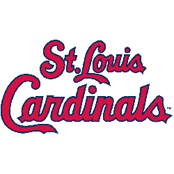
St. Louis Cardinals
1998 - Present
Double lined wordmark "St. Louis" on top and "Cardinals" scripted in red with a navy blue outline on the bottom.
Font: Blendhes
https://fontmeme.com/fonts/the-blendhes-font/
St. Louis Cardinals
1957 - 1997
Double lined wordmark "St. Louis" on top and "Cardinals" scripted in red on the bottom.
Font: Blendhes
https://fontmeme.com/fonts/the-blendhes-font/
St. Louis Cardinals
1949 - 1955
An updated version of the "birds on the bat" logo returned in 1949 with the word "Cardinals" written beneath the bat. Added is a white cloud with a blue haze that goes around the birds. A wordmark "St. Louis" in black on top.
Font: Custom
St. Louis Cardinals
1949 - 1950
Two cardinals perched on a brown bat between the red letter "C" with the scripted wordmark "Cardinals."
Font: Custom