Atlanta Braves
A red tomahawk with gold and blue details below wordmark “Braves” scripted in blue and red. The Braves darkened the shade of blue and gold on this logo prior to the 2018 season.
Atlanta Braves
2018 - 2022
A red tomahawk with gold and blue details below wordmark "Braves" scripted in blue and red.
Darkened the shade of blue and gold.
Atlanta Braves
1990 - 2018
The current Atlanta Braves logo consists of an axe, placed below the wordmark "Braves." The entire logo is diagonally inclined towards the right side. The axe depicts the power and the team’s persistent attempts to perk up their performance.
Atlanta Braves
1987 - 1990
In 1987 the only change to this logo was the darkening of the color blue.

Atlanta Braves
1985 - 1987
The image of the native American has slightly increased. The script font of the wordmark “Braves” changed, also the border changed to a blue and then white border.
Atlanta Braves
1974 - 1985
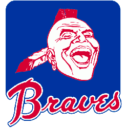
In 1973 the Braves logo the most drastic change to their logo. A rounded blue square was added to the laughing Native American. The native American is now a silhouette in the color of red. The wordmark "Braves" is now red with a white and blue border.
Atlanta Braves
1968 - 1974
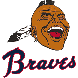
A dark blue with red outline wordmark "Braves" was added below the Native American. The image of the native American was made smaller to make room for the wordmark.
Atlanta Braves
1966 - 1968
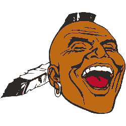
Slight changes to the Native American he bow has brown skinned. The feather and ear ring is white. The image of the native American is now larger.
Milwaukee Braves
1957 - 1965
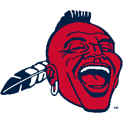
In 1957, the logo featured a laughing Native American with a mohawk and one feather in his hair. This logo went through several changes, however lasted for over 35 years.

Milwaukee Braves
1953 - 1957
The native American has returned will color. Now the Native American has brown skin color with black hair. The headdress is now red features with a green and orange headband.
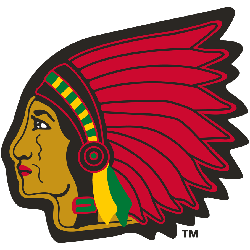
Boston Braves
1945 - 1952
The native American has returned will color. Now the Native American has brown skin color with black hair. The headdress is now red features with a green and orange headband.
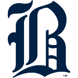
Boston Braves
1941 - 1944
The Braves continued with the old english letter "B" again in a dark blue. The letter "B" stands for the city of Boston.
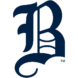
Boston Bees
1939 - 1940
The Bees logo went to an old english letter "B" in blue. The letter "B" stands for the city of Boston.
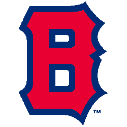
Boston Bees
1938 - 1939
Same block letter "B" now in red with a blue outline. The letter "B" stands for the city of Boston.

Boston Bees
1937 - 1938
The logo changed to a block letter "B" again yellow with a blue outline. The letter "B" stands for the city of Boston.
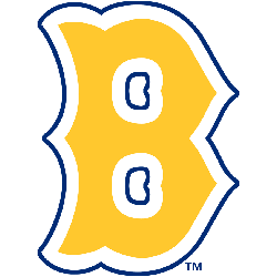
Boston Bees
1936 - 1937
The logo changed to a block letter "B" again yellow with a blue outline. The letter "B" stands for the city of Boston.
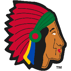
Boston Braves
1929 - 1935
The native American has returned will color. Now the Native American has brown skin color with black hair. The headdress is now red features with a green and orange headband.
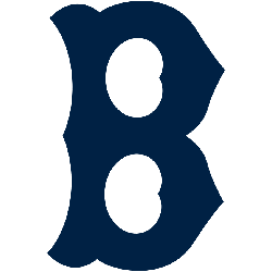
Boston Braves
1925 - 1929
A different variation of the old style letter "B" in a little blue. The letter "B" stands for the city of Boston.
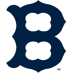
Boston Braves
1921 - 1925
The Braves went back to the old style letter "B" in blue. The letter "B" stands for the city of Boston.
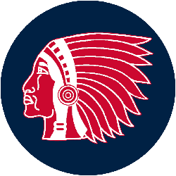
Boston Braves
1916 - 1921
A blue background circle added to the red Native American.
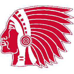
Boston Braves
1912 - 1916
From 1912 to 1956 the Braves on and off logo was a red Native American with a headdress.
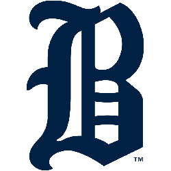
Boston Rustlers
1911 - 1912
The Rustlers went with an old english letter in blue "B." The letter "B" stands for the city of Boston.

Boston Doves
1910 - 1911
For the first time with only a wordmark "BOSTON" in the color red.
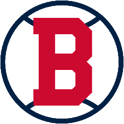
Boston Doves
1909 - 1910
Red bold letter "B" in a black circle looking like a baseball. The letter "B" stands for the city of Boston.
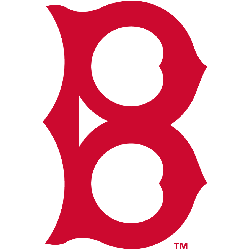
Boston Doves
1908 - 1909
The letter "B" changed to an old style "B" continuing in red. The letter "B" stands for the city of Boston.
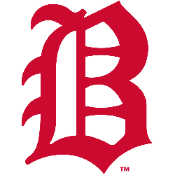
Boston Doves
1907 - 1908
The Doves first logo was the old english letter "B" in red. The letter "B" stands for the city of Boston.

Boston Beaneaters
1901 - 1906
Back to the wordmark "BOSTON" in dark red.
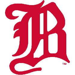
Boston Beaneaters
1900 - 1901
Logo change for a wordmark to the old english letter "B" in red. The letter "B" stands for the city of Boston.
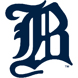
Boston Beaneaters
1897 - 1900
A wordmark to the old english letter "B" in blue. The letter "B" stands for the city of Boston.
Boston Beaneaters
1889 - 1897
Continued the wordmark "BOSTON" now in blue.
Boston Beaneaters
1883 - 1889
Like most teams before the 1900's the logo was just a wordmark of the city "BOSTON."
Atlanta Braves Logo History
In Atlanta Braves baseball, the primary logo unites players and fans alike. Its timeless design shines in Atlanta Braves MLB games, reflecting the team’s competitive legacy. From historic moments to modern triumphs, the logo remains a fan favorite. Visit the official Atlanta Braves MLB page to explore the team’s history, roster, and latest updates.

Time to Vote Braves Fans
Step into the captivating MLB Team Logo Battle arena, where the Atlanta Braves logo, a proud representation of our unmatched legacy and unyielding spirit, squares off against the symbols of other teams. Our emblem, with its distinctive tomahawk, isn't just a logo. It's a rallying cry that symbolizes our indomitable will and tenacity. This design, steeped in tradition and determination, captures the very essence of Atlanta - strong, resilient, and fiercely passionate. As Braves fans, we wear this emblem as a badge of honor and a show of strength. Join us in this exhilarating showdown as our logo battles for supremacy, embodying the fighting spirit of the Atlanta Braves and their supporters. Let's prove that our logo doesn't just stand out; it stands above the rest!
