The Atlanta Braves alternate logo collection showcases the team’s vibrant MLB spirit. Featuring bold tomahawk and feather designs, the Atlanta Braves logo enhances team identity. This collection highlights Atlanta Braves logo history, uniting fans with the dynamic tradition of Atlanta Braves logo baseball.
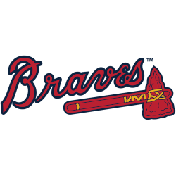
Atlanta Braves
2022 - Present
A red tomahawk with gold and blue details below wordmark “Braves” scripted in blue and red. The Braves darkened the shade of blue and gold on this logo prior to the 2018 season.
Atlanta Braves
2012 - Present
Crossed red tomahawks with blue trim and yellow string on a blue circle with the wordmark "ATLANTA BRAVES" on the bottom in white and "1876" on the top in red. Worn on the sleeves of home alternate / throwback uniform.
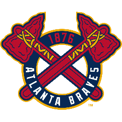
Atlanta Braves
1987 - Present
A letter "A" in scarlet with navy trim. The letter "A" stands for Atlanta.
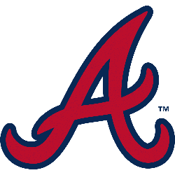
Atlanta Braves
1972 - 1975
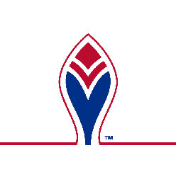
A blue and red feather outlined in red on white, worn on the sleeve of the Atlanta Braves road jersey only from 1972 - 1975.
Atlanta Braves
1966 - 1971
Native American Head laughing with a white and black feather and white ear ring.

The Bold Atlanta Braves Logo
A striking tomahawk and feather define the Atlanta Braves logo in this alternate collection. Atlanta Braves logo history traces the evolution of Atlanta Braves logo baseball designs. Fans cherish Atlanta Braves logo PNG downloads. Additionally, check the Atlanta Braves wordmark logo. It showcases more styles in this iconic collection.
Alternate Atlanta Braves logos energize Atlanta Braves logo baseball games. Rooted in Atlanta Braves logo history, these designs amplify team spirit. Furthermore, Atlanta Braves logo PNG files captivate collectors. Visit the official Atlanta Braves MLB page. Discover the team’s legacy and updates. Consequently, fans embrace the Braves’ vibrant tradition.


